louvre

génial

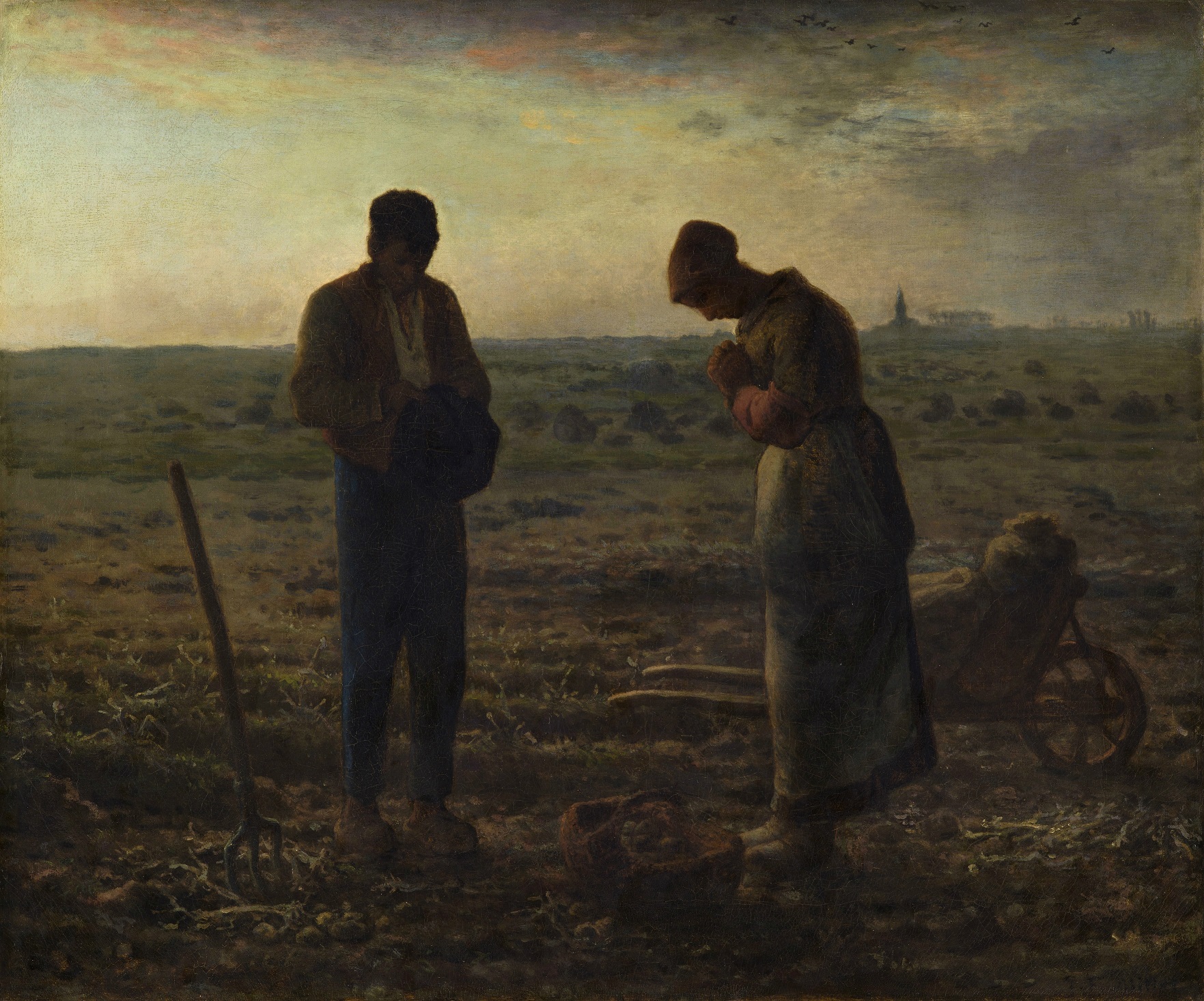
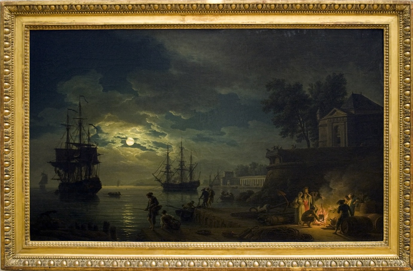
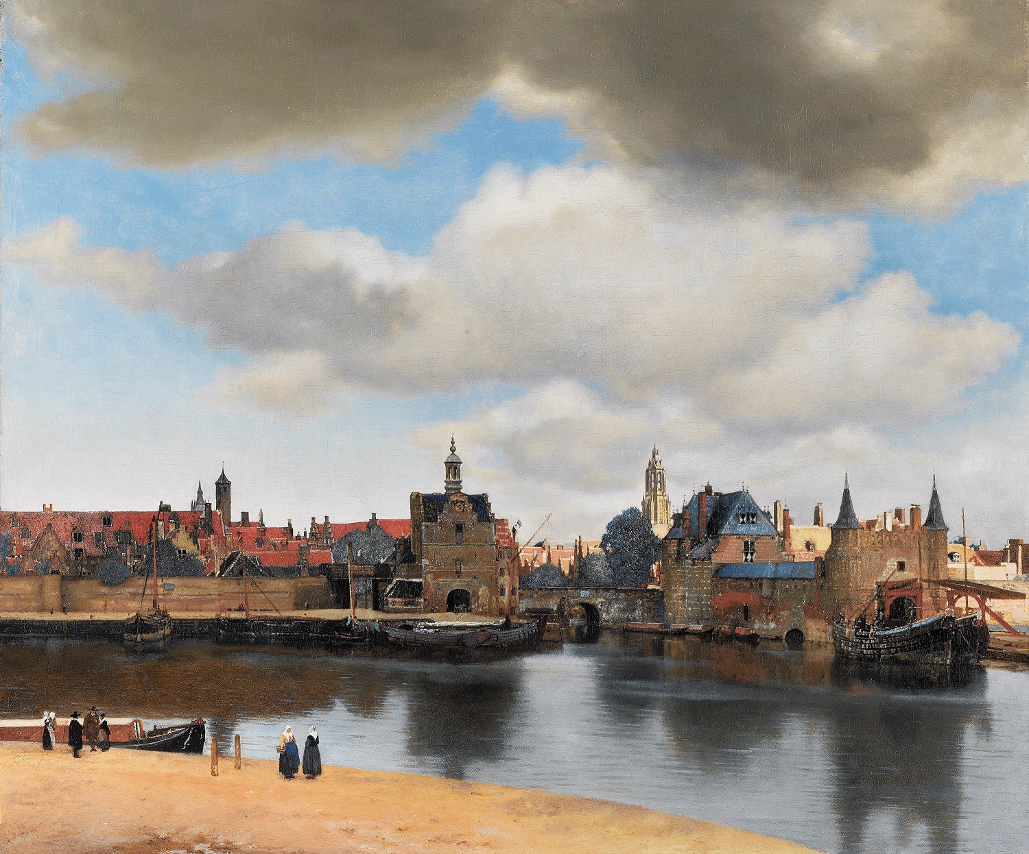
I recently got a chance to spend some time with what might be my favourite painting of all time, View of Delft (Vermeer), 1661. The painting portrays the artist’s hometown, surprisingly much larger than anticipated but complete with every glimmering ripple in the water and every rouge brick expertly painted, and the ever present rolling billowy clouds swathing quarters of the town in shade. In 1661 cityscapes were not a popular scene, paintings of the time usually favoured interior Dutch Genre scenes, so the rareness of such a painting is a gem in itself. What’s amazing about Vermeer is his ability to render scenes in exquisite detail. There are plenty of Dutch contemporaries who have created many fine works of similar quality, but there is something special about Vermeer. There is something that sets him apart from the others, some special relatable quality of his works which pluck at our heart strings.

There is hot debate about how Vermeer came to be so amazing, and the amount of evidence and speculation have lead the art community to take choose camps to support and usually battle each other quite viciously. The debate surrounds the notion of Vermeer using visual aids, but frankly the debate comes down to the idea of genius. There is this romantic idea that artists have some special talent that is imbued in them like a magic spell, which gives them superpowers that allow them to create great masterpieces which the general rabble couldn’t achieve, and some argue, can’t even comprehend.

ViewOfDelft-Vermeer1662

You wouldn’t understand, you are not an artist.

To suggest that an artist used a device which greatly aided their task tarnishes the illusion that artists have god-given specialness and therefore diminishes the value of the work. Where do we draw the line for what tools are acceptable? Many artists use a grid and rulers to plan their work, to keep it in line with their source material and notions of perspective. If two artists paint nice pictures and one uses a grid to plan their composition, is one really more impressive than the other? What if we aren’t aware which artist used the grid.. does it really matter? Those who believe that aids were used “argued that naysayer art historians dreaded the use of mechanical device, because it would diminish the stature of the artist’s as a creator and, perhaps, a bit of the prestige of the art historians themselves, key negotiators between the artist and the public” 1.

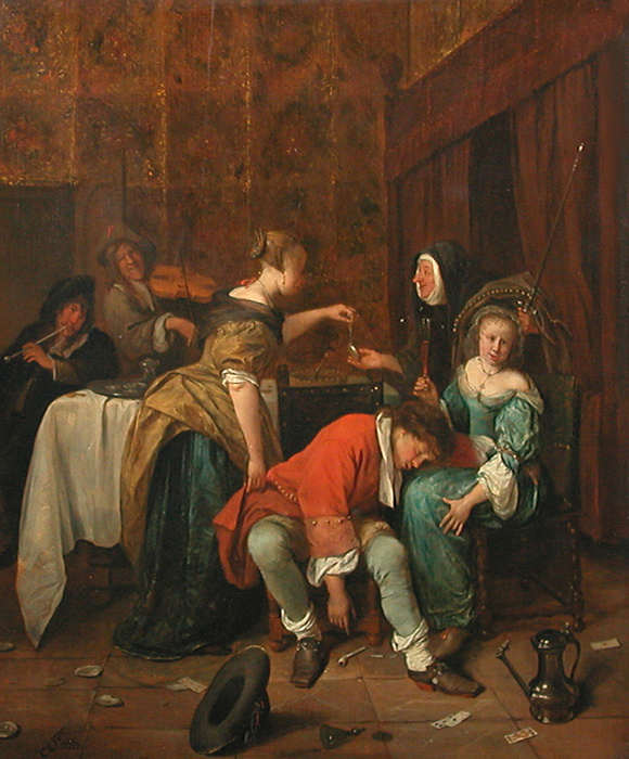
The argument of what makes art “art” is very long and convoluted but it is generally agreed that if a work is visually interesting or represents and interesting idea then it has value. Paintings which we can easily relate to the subject and appreciate its accuracy to our reality is a primary basis for judgement, and one that is particularly comforting. The admiration for accurate depictions of reality is long-standing and historically considered to be essential criteria for measuring an artists’ or works’ worth. Vermeer’s drive for visual realism, coupled with his love for ordinary Dutch society allows for a very honest and dedicated civilian cross section. Among his contemporaries you will find a great number of commissioned portraits of merchants or gentlemanly societies, interior scenes with exaggerated debauchery and similar fodder for moral undertones. Vermeer is no stranger to moral undertones yet his are more of a whisper than being knocked over the head with it. His scenes usually depict idyllic domesticity, the sheer timeless perfection of it enough to drive a person to desire the good life. His subjects are painted in utter perfection, in fact so much so that we are lead to believe that Vermeer is either a genius or a cheat to achieve such an accomplishment, and so the speculation begins.

One example of Vermeer’s style which suggests the use of aids is the extreme perspective accuracy. Vermeer “could have observed and even been stimulated to sketch the more brightly illuminated images produced at a smaller scale by a portable camera obscura [… however] he could have produced them by using graphical methods taught by his fellow countrymen De Vries and Hondius in conjunction with a well-known technique which made use of a pin inserted at the vanishing point with a thread attached to it and held taut to define the orthogonals of the scene” 2. Using grids and rules to better understand the principles of geometry and perspective is not a secret. Many attempts were made to understand spacial order in Medieval times, ultimately culminating in the understanding of linear perspective developed in the Renaissance. Regardless, for Vermeer, there is considerable evidence that he specifically used optical devices as aids to create paintings. There is, however, no historical or archival data to confirm this notion, including the fact that the detailed inventory of the artist’s belongings drawn up after his death does not include a camera obscura or any similar device 3.

Johannes_Vermeer_-_The_lacemaker_(c.1669-1671)

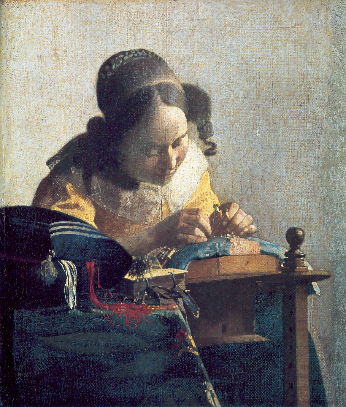
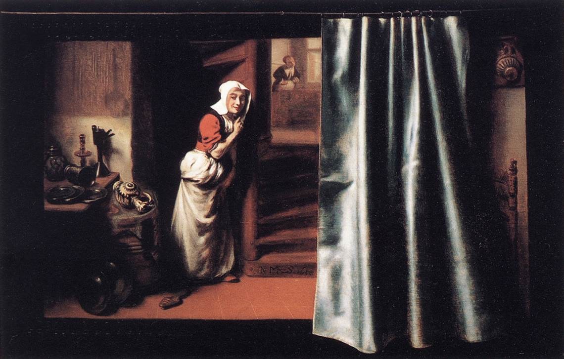
The Lacemaker, (Vermeer)1670

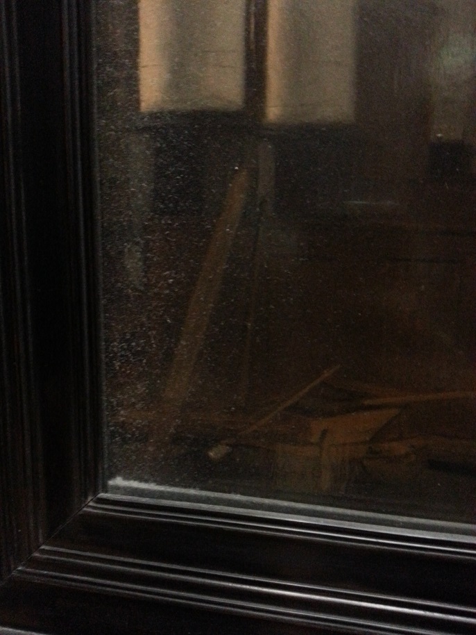
Instead, scholars and critics look to the paintings themselves to glean bit of evidence of optical illusions rendered into the work. For example, Daniel Fink built a camera obscura in 1971 to observe objects similar to those found in Vermeer paintings, and observed them in the same conditions that the artist would have as confirmed with historical data. Fink believes there are optical elements directly resulting from a camera obscura in most of Vermeer’s works including but not limited to ; “variations [of]principal planes of focus, halation of highlights, relative detail in still life portion versus figure detail, consistent proportions of the paintings (4-5:5 or almost square), [and] dimensional precision in rendering objects” 4. My research into the optical illusion debate contains many references to the Lacemaker (Vermeer), 1670, so I took a quick trip down to the Louvre to investigate this work a little closer.

pointilles

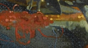
extreme close up!! whoaaaaa!

It is suggested that the unfocused areas of the work are the direct result of lens and/or camera intervention. Furthermore, “maximum highlights glimmer with the so called disks of confusion, or pointillés as they are sometimes called when they are translated into paint. Pointillés, a conspicuous feature of many of Vermeer’s paintings, cannot be perceived with the naked eye and do not seem likely stylistic invention. The are, however, produced by the camera obscura’s imperfect lens” 5. Indeed, many aspects of the Lacemaker are almost abstractly blurred, fuzzy blobs of paint akin to the type of pointillés and diffusion known to us now in the photographic era. Though the use of lenses in the exploration of telescopes and cameras was not unknown to Vermeer at the time, the notion that Vermeer chose to paint certain areas out of focus and certain areas very focused does not prove the usage of cameras and lenses as aids. The Louvre’s blurb on the work suggests that it was Vermeer’s genius to paint certain areas in and out of focus to mimic binocular (vision) to provide a livelier portrayal, “reproducing the natural optical deformations of the human eye by creating several depths of field […] the lacemaker’s painstaking work, is shown in great detail and in sharp focus, particularly the fine white thread stretched between the young woman’s fingers. Further away from this visual focus, the forms become more blurred, including, paradoxically, those in the foreground” 6. The use of curved lenses leads us to believe that the choice to have the subject in focus and the fore and back grounds unfocused was simply the work of the device and Vermeer no more than a a simple scribe transferring the information provided into paint. Ie. diminishing the notion of the artistic genius.

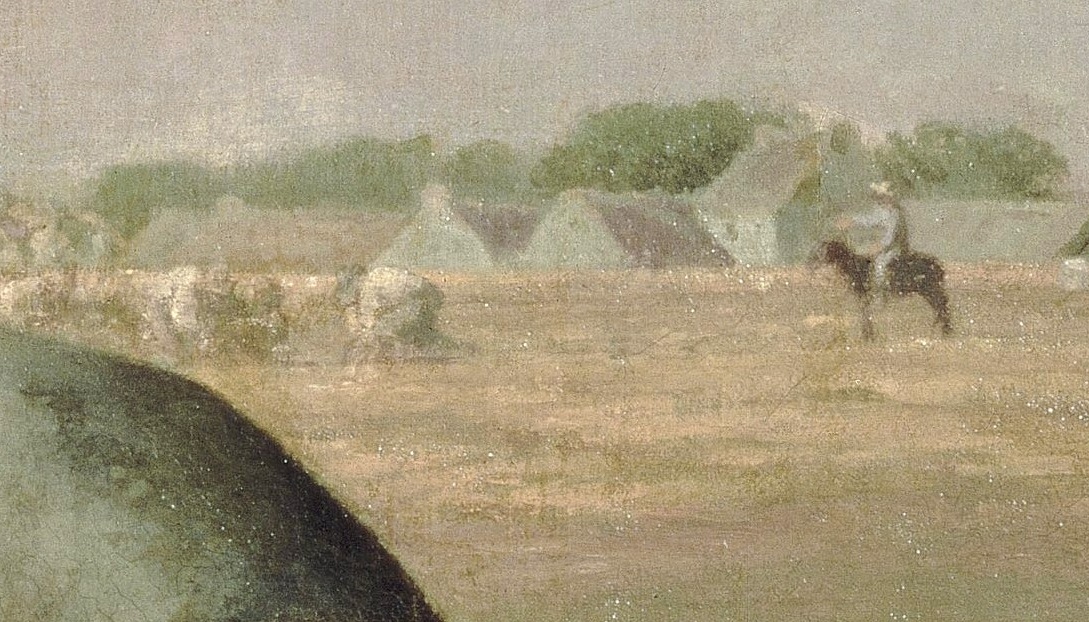
Similar techniques are employed in the View of Delft; “the pointillist technique that Vermeer used to suggest reflections flickering off the water, most easily visible on the two herring boats on the right, is evidence that he probably used a camera obscura to help compose the picture; diffused highlights such as these would appear when a partially focused image was obtained from this device” 7. It is not beyond the realm of possibility that Vermeer used such device as an aid but it is dangerous when you begin to assume that the use of such device negates all artistic intention. One issue with a camera obscura is that it is obtained by a pin-hole of light entering a darkened room. Read: darkened room. It is very presumptuous to believe, as is presented in the acclaimed film “Tim’s Vermeer” that any old person is able to render what Vermeer did with nothing more than a lens and paintbrush.

delftboat

View of Delft (Vermeer), 1661, Detail

It is also suggested that Vermeer used an inverted Galilean telescope to create View of Delft. There are peculiarities of the painting which it has been suggested are optical effects that are a direct result of this device, which “condensed the panoramic view of Delft, diminished figures to smaller magnifications than normal and emphasized the foreground” 8.  Here there exists a paradox. The painting itself is very detailed and expertly rendered, and if you believe he used optical devices the artist was slave to the conformations of optical devices and had no intention to compose the scene in any intelligent, artistic or creative way. However “in a topographical drawing by Abraham Rademeker (1675-1735), executed about half a century later from a similar vantage point, it is noticeable that the buildings appear taller and crammed closer together than in Vermeer’s picture. Vermeer seems to have shifted the buildings slightly to produce a more harmonious composition” 9.

At what point does the artist’s creative genius work in tandem with rendering tools? At what point does the tool make more aesthetic decisions than the artist? The are all questions we find ourselves asking in a more modern era, considering the advent of multiples and auto-creation. Is photography art? Does the artist’s intention, composition and execution of a photograph enough to consider it as meaningful as a painting? Does the camera itself take away from the magic of art-making? Does polaroid take more share in the credit for a famous photograph because it makes certain aesthetic choices for the artist? Warhol explored and challenged the notion of uniqueness and authenticity by developing a factory of artists churning out silkscreens. At what point does a Warhol stop being a Warhol? At what point does the artist’s vision for the finished work get interrupted by the technological aspects of its creation?

door_knocker

Halation. Source : Jonathan Janson

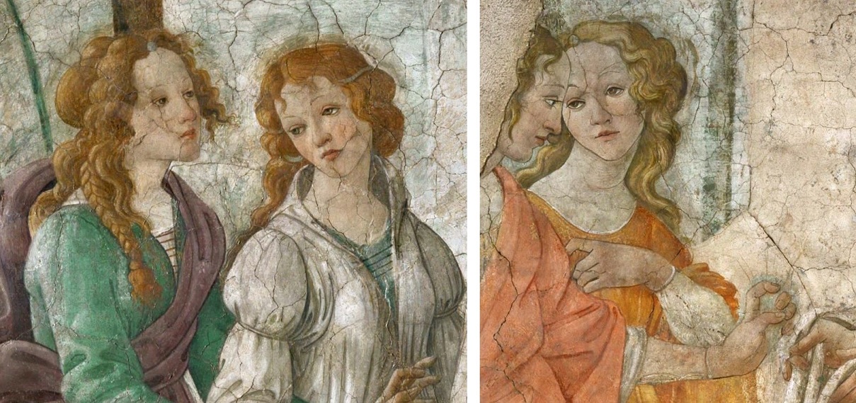
Andy Warhol’s 1964 “Red Self Portrait” was deemed not genuine by Andy Warhol Foundation for the Visual Arts, even though it was signed and dated in Warhol’s handwriting, and was included in the catalogues of his oeuvre published during his lifetime. Warhol had taken a self portrait in a photobooth, transferred it to silkscreen, delivered it to commercial printers with explicit instruction as to the creation and end result and had them do the work. The simple fact that he was not physically present during the final stage of its creation deems it not genuine by governing authority. The board’s lawyer himself admits “it has to do with the intent of the artist… if Warhol conceived the idea and he then directed someone else to prepare a silkscreen, and he then supervised the process of production and in effect signed off on it, whether or not he signed his name to it, as long as he said, “That’s good, that’s what I wanted,” Warhol created that work”10.

Despite the distortions evident in Vermeer’s work, whether or not they were inspired by the illusions of optical devices, there are a number of reasons to give credit to Vermeer as an artist of creative and brilliant foresight. The pleasing composition of the city scene contains both accurate depictions of Delft at that time and invented pictorial division. It has been noted that Vermeer intentionally spaced out the buildings to give both literal and interpreted pause and rest between them, despite accusations that an inverted telescope in fact would have condensed the scene. As I believe it is the artist’s aesthetic intent which creates a photograph rather than simple film processing, Vermeer chose the view to portray, as an artist decides when and how to point their camera. “A.K. Wheelock, who originally enthusiastically embraced the camera obscura-Vermeer tie, has backtracked and now holds that Vermeer “must have admired certain effects of color, light, and focus in a camera obscura, but that he persistently departed from what he actually saw in the camera, in his studio, or in another artist’s work in accord with his own highly refined aesthetic and expressive goals” 11. Vermeer’s choice of scale and cropping ends up with a balanced composition hinting the viewer as to the nature of the city itself.

GirlWithTheRedHat-Vermeer1665

Halation con’t. Girl with the Red Hat (Vermeer), 1666

Vermeer worked slowly, producing considerably few finished works during his lifetime. His style is meticulously detailed, the treatment of light especially pragmatic and the careful and loving depiction of simple objects elevates the banal to celebrated heights. “The meticulous way that Vermeer worked on this masterpiece is shown by the fact that he mixed grains of sand into some of his paint to achieve a certain texture. An examination of the picture has revealed that the sand was added to the ochre used on the window frames of the long building to the left, behind the ramparts, giving a greater reflective quality to the paint surface” 12. Vermeer’s choice to portray the scene in such a way as to allude to the pleasant and upstanding interpretation of Delft is also evident in the composition of the lighting. The majority of the scene, as is common with other Dutch paintings, is sky. The aesthetic of having compositions predominantly sky reflects not only the pragmatic and protestant Dutch lifestyle but also practical aspect of lowland painting, such as the low areas of land excluding large changes or areas of visual interest, combined with the ever present billowing clouds typical of the region and unequalled Dutch light, said to have a unique quality. “Historically, the Dutch maintained a unique and tangible relationship with their land, quoting a popular Dutch saying: ‘God created the world, but the Dutch created Holland’ 13. The large dark clouds swarm the top of the scene, giving the viewer respite from the bright light of the sun. The immediate areas of town are shaded yet clear and rich in colour, perfectly crafted. The congestion of the town as is recedes into the background stunningly highlighted by the sun’s break from the clouds, brilliantly illuminating the New Church. Vermeer aspired to portray “View of Delft reflects Vermeer’s concept of beauty and the prominent churches could be a subtle reinforcement of Christian morals and values of this time. It could also be that by painting the Old Church in shadow and the New Church in sunlight that he was portraying the city’s spiritual growth” 14.

laceview

Source : http://arthistory.we-wish.net/2008/11/24/highlights-of-paris/

The more scientific explorations of Vermeer’s secrets comes up with more and more complicated conspiracy theories. There are undeniable peculiarities in Vermeer’s work which correspond with effects from optical devices that would have been available to him at the time, though there is no evidence to prove he ever owned any. Even if he did, so what? Even if he looked at his subject through a lens or a telescope, passing the light through lenses to be able to see the subject’s detail more closely and to be better able to passionately dedicate this information to paint. Vermeer made around three paintings a year, dying in young poverty and relatively unknown outside Delft. We still know that he employed the most expensive pigments at a far greater quantity than his contemporaries, spending such exorbitant amounts of time on each painting making any kind of decent wage is outside the realm of possibility. His dedication, however, is key to his genius. If Vermeer used optics, well so what. It may have been another tool in his toolkit, another instrument to employ in his endeavor for, and ultimately his success in perfection.

1, 2, 3, 4, 5, 11 http://www.essentialvermeer.com/camera_obscura/co_one.html

6 http://www.louvre.fr/en/oeuvre-notices/lacemaker

7, 9, 12 Bailey, Matin. Vermeer. London : Phaidon Inc., 1995.

8 Ferguson, Rex. Criminal Law and the Modernist Novel : Experience on Trial. New York : Cambridge University Press, 2013.

10 http://www.dailymail.co.uk/home/moslive/article-1242915/When-Warhol-Warhol-The-2-million-self-portrait-turning-art-world-head.html

13 Gold, John R, George Revill. Representing the Environment. London : Routledge, 2004.

14 http://www.artble.com/artists/johannes_vermeer/paintings/view_of_delft

parapluies dans le bain

Despite my SO working long hours we try to make time to get out and sightsee.. and it’s easier to accomplish when I show up at work for a three course lunch and afternoon husbandnapping. We finally managed to get French SIM cards, which means cell usage is now local rates instead of international so it’s easier to meet up while out and about. That being said I still forget what its like to live without data so we inevitably forget to look up the hours for things before we go.. like the Orangerie and Grand Palais. Hint : both closed on Tuesdays.

IMG_7267b

IMG_7267f

We still managed to get some more mileage on the vélos before this realization. We instead went to the Petit Palais, and though the collection is somewhat small and Courbet-y its still a ridiculously nice building (Palace) complete with amazing chandelier.. well really, everything is nice. The more time we spend in France the more I foresee a courtyard in our future.

IMG_7271

They also have a little collection of non-Courbet realism, which is very nice. The dichotomy of the subject matter with their grand size and detail, hung in the glimmering halls of a palace is interesting. The way the subject is treated inherently gives you information about how you should feel about the painting. Two paintings really caught my eye, both by Fernand Pelez.

IMG_7275

Sans Asile“, 1883, gives you a scene firmly grounded in the stone foundation of Paris, the stark wall behind the figures not giving you any way around the figures, no where else to look except to notice the remnants of posters on the wall advertising fancy parties for the aristocracy. The woman is not engaged in chores nor is she distracted by anything else. She directly faces you, her gaze fixated on you, demanding attention. The children sleep around her and the baby suckles at her breast, participating in things that all children do. However the older boy has become more aware of their situation, aware that they are in a different situation to other children. He is growing up in this painting, coming to realize the disparity of it all and begins to emulate the same actions of his Mother. The mirroring of mother and child here also gives the impression that their poverty is cyclical, their impoverishment passed down and continuing through the generations.

gericault-military

By contrast, Géricault created a series of portraits of beggars and insane people, some of these are at the Louvre. The figures are those who are normally hidden and marginalized by society but Géricault elevates them to a stature worthy of having your portrait painted, normally reserved for the rich and important. But the information that’s given in the works is much different than Sans Asile in the relatively small scale and quickness of the application. The figures are not carefully painted appearing looking away and fidgety as if they are constantly distracted by their malady. They are fully consumed by it. The blackness of the background gives the impression they are enveloped in a world of uncertainty. The figures are not given names, only identified by their condition. Criticisms of early psychiatry argue that “classifying, containing and observing people was effective only in silencing the voices of the mentally ill, rendering them invisible and therefore subject to abuse”1. But giving them recognition and exploration into their personal lives provides an air of empathy and dignity. Géricault is believed to have had a mental breakdown after completing his psychologically taxing masterpiece the “Raft of the Medusa” and as a Romantic painter is devoted to portraying intuition and emotion over reason, exploring the wild and aweful turmoil of the natural world, as well as a revolt against order and idealization, and rationality. “What perhaps strikes one most about the portraits is the extraordinary empathy we are made to feel for these poor souls, who might not strike us immediately as insane, but who certainly exhibit outward signs of inward suffering”2.

IMG_7278

There is another Pelez painting right beside entitled “au lavoir”, 1880. The scene is of washerwomen perpetually engaged in their labour. There are some items around but none that aren’t washing-related indicating the is no reprieve or separate identity for these women. Similarly, they are in a darkened room with no reference of time of day to determine beginning or end to their chore. The woman rings out the garment, her arms muscular from practice, her legs apart and anchored firmly. She represents the hardworking and resilient woman, the labourer. She embodies both the typical role of a woman but at the same time, the antithesis of typical feminine appearance and demeanour.

IMG_7276

Another nice painting in that room is Les Halles” (Léon Lhermitte), 1895. I really like the bustling composition and the snippets of folks in their market-day actions. I also like that you can still go to Les Halles well over 100 years later and walk around the open air shops and stalls that run down the same streets. Though these days there are less chickens.

IMG_7285

img_72

IMG_7288

We also biked to Église de la Madeleine, situated just north of Place de la Concorde: the giant roundabout complete with Egyptian obelisk and crazy fountains. Église de la Madeleine’s design is based on the Roman temple Maison Carrée. Interesting side note : Frederick Chopin requested Mozart’s requiem be sung during his funeral but the church did not permit women it its choir. Eventually, the funeral was allowed to proceed only if the female singers remained hidden by a curtain.

IMG_7291

klaxonner

After checking out the church we walked down rue Réaumur to ogle the copper pans in the highfalutin chef stores and wander down some tiny restaurant-filled alleys just ducking into the subway before the rain started. Though we did manage to encounter our first subway delay in two months and ended up walking the four remaining subway stops in the rain, stopping for bread and chouquettes, which are little puffed clouds of deliciousness. I seriously need to learn to make these because they are so delicious, plus they’re the closest thing to timbits here.

0290017105961502-c2-photo-oYToyOntzOjE6InciO2k6NjU2O3M6NToiY29sb3IiO3M6NzoiI0ZGRkZGRiI7fQ==-recette-pas-a-pas-de-la-pate-a-chouquettesCrédit : © AlexQ – Fotolia.com

1, 2 http://smarthistory.khanacademy.org/gericaults-portraits-of-the-insane.html

bedriegertje

Continuing with some more Dutch Reformation Interior church paintings, there is another one at the Louvre which caught my eye, but not because of what you could see, but what you couldn’t.

rideau

Intérieur d’église à demi masqué par un rideau
(Hendrick Cornelisz van (der) Vliet), 1660

The small work depicts another Protestant church interior, again with people chatting, dogs running around, graves being dug, but painted in the absolute foreground is a curtain, covering the rightmost area or the scene. The piece itself is painted so that it appears to be an arched panel with the curtain on top, covering the work. The arch helps to give the curtain that extra boost to make is seem like it’s really not part of the scene, but resting on top like something someone would add later. It hearkens at the tradition of covering paintings with curtains to protect them from sunlight and dust, only drawn to observe briefly and then covered again.

exs

i have to provide photo credits for things not in the public domain. lame. (below)

The technique is called a trompe l’oeil, deceiving the eye, an object painted in a way to trick you into thinking it’s in three dimensions. You’ve probably seen many examples before, such as chalk art, wall murals or stuff like faux leather or marble.

Interior of the Nieuwe Kerk, Delft, with the tomb of William the Silent, by Hendrik van Vliet

The interior of the Nieuwe Kerk in Delft with
the Tomb of Prince William the Silent of Orange (1533-1584)
(Hendrick Cornelisz van Vliet) 1660

Van Vliet used this trick in many of his works, especially ones depicting interior church scenes, though van Vliet was definitely not the first to employ the trompe l’oeil curtain. It has its roots in religious paintings, as “can be observed on miniatures and bas-reliefs from late Antiquity and which became a topos of representations of Mary” 1.

747px-RAFAEL_-_Madonna_Sixtina

I’ll take “creepy faces in paintings in the background
that are bad for late night blogging
” for 400

You might recognize the famous cherubs in Raphael’s Sistine Madonna (1512), but the whole work itself is quite lovely, and the curtains act as a rich and velvety frame for the posed figures, but not as part of the scene. The curtains are depicted as hanging on a thin rod, which is bending under the weight of the drapes. This realistic touch adds to the idea that the curtains aren’t part of the scene. If they were they would be idealized, quite like the rest of the work.

Matthias_Grünewald_-_The_Annunciation_-_WGA10750

let’s play find baby Jesus. hint : in this one he’s a bird

The curtains containing the scene hearken at the practice of having the ciborium or other parts of the church covered by curtains to be revealed at certain points during services. Another example of this is the leftmost panel in the second state of Grünewald’s Isenheim Altarpiece, “the Annunciation” (1515), though, in this scene the curtains are painted into the scene with two panels used to frame the scene, and to indicate the altar.

van_Vliet-InteriorOudeKerk_PietInterior of the Oude Kerk, Delft, with the Tomb of Piet Hein.
(Hendrick Cornelisz. van Vliet) 1653

The curtains also serve as a way to literally draw attention to a particular section of the work, to frame it. They can act as a vignette to create emphasis on the interior of the picture, or to highlight elements to which your attention should be placed. “The drawn curtain and drape have obvious theatrical associations. Both imitate the curtains over the central archway of the Renaissance stage, which are suddenly pulled back at key moments in the drama to reveal important scenes and characters. Dutch painters often used the curtain to suggest dramatic revelation without actually reproducing a theatre” 2.

girlreadingletter-openwindow

“allowing him only the parerga, the indicators of the representation,
in the feigned frame, curtain, and the internal spectator” 3

The curtain in Vermeer’s Girl Reading a Letter at an Open Window (1659) is a similar effect to the Church Interior in that it serves to hint at the preciousness of the scene as a cherished artwork would be protected by a curtain, but also helps to provide some shelter and seclusion to the scene as if we are peeking in at a quiet or intimate moment. Similarly, Metsu’s Woman Reading a Letter (1666) uses the curtain as a way to provide details about the scene, as we get to experience the moment when the curtain is drawn.

??????????????????????

“A lady sits reading a letter that her maid has presumably just delivered. The maid explicitly calls attention to the seascape on the wall by pulling aside the curtain that covers it. The maid’s quasi-explanatory gesture suggests a connection between the seascape and the contents of the letter” 4. The curtain helps us to gather some information about context or the situation the work depicts.

Houckgeest-InteriorOudeKerk1548Interior of the Oude Kerk Delft, with the Pulpit of 1548
(Gerard Houckgeest) 1651

Like other Dutch paintings from this time, the clues in the work are given to help the viewer translate the work into a story, so the curtain acts not only as a visual element but gives information to the viewer. Protestant reformation in the Netherlands influenced the inspiration and content of artworks, which transitioned from the sacred and public works to a more private and secular audience. This shift also influenced the connotations of the painted curtain. “The trompe-l’oeil curtain gradually loses its sacred connotation, retaining only that of metapictorality”5.

FlowerCurtainart jokes : priceless

The painted curtain in Dutch genre paintings was sometimes referred to as “ bedriegertje” (little trickster) from its ability to trick the viewer into thinking it’s a real curtain covering the work. A very fine example of pure trickery is the “Trompe l’oeil Still Life with Flower Garland and Curtain”, a work co-created by Adrian van der Spelt & Franz van Mieris in 1658. Van der Spelt was said to be an expert at painting realistic floral still lifes, and van Mieris an expert at painting fabric textures, so the two got together to create a work of visual richness, and is one of my all time favourite works. Not because it says something important per se, but that these guys decided it would just be really cool to make this painting.

eavesdro-maes

you bedriegertje !

The curtain could also be used to draw attention to the fact that it indeed hides aspects of the work permanently from the viewer. For example, Eavesdropper with a Scolding Woman (Nicolaes Maes), 1655, is a interior scene quite typical of the times, peering in to someone’s everyday life. We can see partially up the stairs into a corridor, where a woman appears to be scolding someone but a great amount of the work (including the subject of her fury) is hidden by the painted curtain. “By opening the curtain, the painter literally reveals a badly managed household: the maid spends more time listening than working, and the mistress does not create domestic harmony” 6. So, not only does the curtain act to draw attention to the remaining figures and literally hides certain elements of the scene, it also helps us to gain information by what is missing.

Interior of the Nieuwe Kerk in Delft with the Tomb of William thTomb of William the Silent in the Nieuwe Kerk, Delft, with an Illusionistic Curtain
(Emanuel de Witte) 1653

1, 3, 5 Van Eck, Caroline and Stijn Bussels. Theatricality in Early Modern Art and Archetecture.  Chichester, West Sussex: Blackwell Publishing, 2011.

2, 4 Hollander, Martha. An Entrance for the Eyes : Space & Meaning in Seventeenth-Century Dutch Art. Los Angeles: University of California Press, 2002.

6 http://www.wga.hu/html_m/m/maes/eavesdro.html

Photo credits

truck : Karine Magaton http://apndv.free.fr/Sculpture%20geante.htm

flatiron building, Toronto : 1000thingstoronto http://1000thingstoronto.com/14-flatiron-building/

marble : biphut deco http://hiphutdeco.com/blog/tag/faux-marble/

painting : Andrea Mantegna : Oculus on the ceiling of the Spouses Chamber, castle of San Giorgio in Mantoa, Italy

quattro passi

The weather has abruptly turned chilly, and we’re heading into a long fall. This is something quite new to me. I’m used to the beginnings of fall followed by delightful indian summers and then uncompromising winter. Instead l’hexagonne seems to have long dreary cool falls. and a complete lack of turkey which makes Thanksgiving pretty lame. Also, no Thanksgiving. I’m missing apple picking and pumpkin-patch-traipsing, chardonnay and (Mother’s) homemade pie.

IMG_7186

In an attempt to get over this flu I’ve taken to alternating going-out-days and sleeping-in-and-playing-video-games-all-day.. days. My small excursions, however, took me to the Louvre for small visits, gardens, concerts, churches and museums.

IMG_7180

On one of the nicer days SO and I agreed to meet after work at Jardin des Plantes to take in the late-blooming flowers before they’re gone for the year. This garden is much more lax than the others, less strict and contrived and more free-spirited. We had a lovely picnic (or, pique-nique as they say) mixed in with the strolling daydreamers and running school children. We got to see lots of lovely late-bloomers like ageratum, skimmia, salvia spendens, morning glory and equestrium. That which wasn’t in bloom had equally lovely berries and pods. We also visited the alpine gardens to see some nice rocky shubby growers such as Phyla Canascens, who doesn’t seem to conform to any architectural garden design.

IMG_7190

fuck the police

The Jardin des Plantes is definitely my favourite garden by far, and there are lots of other things to see here another day, such as the Grande Galerie de l’Évolution, the Mineralogy Museum, the Paleontology Museum, the Entomology Museum, the Menagerie (Zoo) and botanical school, winter garden, and Mexican and Australian hothouses. Though we did manage to peek through the gates of the Menagerie to catch some glimpses of wallabies, red pandas and some kind of cool green bird.

IMG_7201

IMG_7206

wallabies are kindof.. wierdos

We also went to check out Sainte-Chapelle, which is a Gothic church built by Saint Louis to house some thirty Passion relics. By the way, Sainte-Chapelle is celebrating its 800th year. It is also under renovation (understandably) so we were unable to see the famous rose window, however the unbelievable grandeur of this place was still quite literally jaw-dropping. The first area is the lower chapel with beautiful painted archways. “The vaults are decorated with fleur de lys, whereas the vault of the upper chapel is covered by golden stars: it’s an example of the recurrent alternation between royal and divine symbols”1.

IMG_7218

IMG_7226

“I have loved the stars too fondly to be fearful of the night”

The upper chapel is accessed by a very narrow spiral staircase. It contains fifteen enormous and very intricate stained glass windows, over two thirds of which are original dating to its 13th century creation. It’s Rayonnant Gothic style marked by its sense of weightlessness and strong vertical emphasis2 fills the room with bright and rich colours, glinting and floating around the room as the sun plays behind the clouds. The church is quite popular, with a very long line for admission and packed quite full. Visitors on the lower chapel are often shushed for their lack of respect in carrying on conversions. There is no need for a shushing attendant in the upper chapel though, the stained glass does that pretty well.

IMG_7220

IMG_7224shiny, captain

We also happen upon the Église Saint-Germain, which by the way is 1000 years old this year. It is in quite a state of disrepair, with a great amount of the paint and frescoes peeling away or so blackened with age they are hardly recognizable. However this small church has a quiet and unassuming atmosphere, especially in comparison with Sainte-Chapelle. It houses a number of lovely statues and paintings, however the loveliest is the Pietà, by Hippolyte Bonnardel.

IMG_7229

Pietà (Hippolyte Bonnardel),1856

The popular image of the Pietà, such as by Michelangelo, often depicts Mother Mary as quite a bit larger than Jesus as there is inherent difficulty in depicting a grown man cradled in a woman’s lap. She is also often depicted very young as a symbol her purity. The Pietà by Bonnardel however is unmistakably realistic, the weight of Christ’s body unable to fit in her lap instead crumpled and draped over her knee. We are reminded of the Crucifixion by the nails arranged at the foot of the sculpture, and the crown which Mary removes. Her gaze is not at the heavens but at Christ. Her gaze, coupled with the realistic stature of both persons give the sculpture a realistic and personal feel. The representation is as much mother and child as it is religious symbolism; the reprieve his suffering captured in the moment she lifts his crown and gazes lovingly at his face conjures up the feeling we all get when our mothers cradle us and take away our pain. I don’t think you really have to be religious to like this sculpture, we all have had mothers.

IMG_7172g

I dont even..

We also got taken our for dinner and a show by SO’s supervisor who is visiting from back home. We dabbled through the Marais, lead along by our guide from memory, peeking in at notable and amusing places. We ended up,in a roundabout way, at Salle Gaveau to hear Muza Rubackyte play a piano concert, which was very nice.

IMG_7172b

Biking down to the Louvre its inevitable that I find something to ditch my bike early for.. like pop-up markets. Sometimes they’re full of veggies, sometimes charcuterie, this time it was overpriced organic honey and giant halva slabs.

IMG_7229d

We also took a very long and rainy trip to visit the Musée Français de la Carte à Jouer, which houses a number of amazing historical sets of playing cards and the original woodcuts and lithos to create them. They had a number of complete collections which you could illuminate on a timer, which I thought was a nice preservation idea. They had a huge number of sets some with stunning designs and many different types such as Italian, Tarot and of course the French design which back home is our standard. A few weeks ago I bought a pack of botanical drawing cards at Tuleries, and now I know why my face cards are Roi, Dame and Valet.

IMG_7172f

IL H O O Q

I’ve been making an attempt to visit the medieval and greek wings of the Louvre, not to eschew them in favour of my preferred medium. These wings tend to be somewhat less overrun with folks so its nicer to wander around. Plus I know very little about Medieval and Greek sculpture so I can just wander happily without having my mind blown every five seconds. Just every fifteen.

intérieur-dusty
20,000 subway pants

Something I’ve noticed about the Louvre is, it’s very very dusty. Especially at the end of the day, after 20,000 people have come through. Literally. It’s not surprising that amount of simple transference of filth is happening right in front of the artworks. Nonetheless, you think they would dust them every once and a while. A great number of works have glass panels in front of them to protect them, especially from folks who would like to slash them with a knife or throw acid at them, just to name a few examples. It it also protects them from accidental damage such as hot moist breath and greasy fingerprints. Seriously people you don’t have to get that up close and personal. Gross. That being said, it makes a sort of doubled-glazed system and I’ve noticed on more than one occasion the collection of dust and debris between the layers.

intérieur-wittetombel

Church Interior (Emanuel de Witte), 1669

Despite the dust, the painting underneath is quite lovely. It features a church interior, whitewashed and somewhat unadorned in Dutch reformation style, though it is adorned with the comings and goings of everyday folks, dogs and gravediggers. What’s truly spectactular about this work is the light and the perpective point. Paintings of church interiors were popular during de Witte’s time, by artists like Houckgeest and van Vliet, though what sets de Witte apart from the others is the gentle play of light and shadow rather than hard perspective lines. “He avoided minute detail, a selling card for many of the Netherlands’ most successful artists, which might detract from the overall impact of the image. His approach to painting can be said to be tonal, rather than chiaroscural” 3. The vibrancy of the paint and and unique perspective point gives the viewer the sense of being in the space rather than looking in upon it.

Emanuel-De-Witte-Interior-of-the-Oude-Kerk-Delft-2-

Interior of Oude Kirk, Delft (de Witte), 1650

“He often incorporated the pulpit or other church furniture in his views of Delft or Amsterdam churches” 4. The incorporation of church adornments and the sometimes depravity of the activity in the church (see Oudekerk above) opens up some interesting questions on de Witte’s motivation : was he merely interested in accurate depiction of light and shadow? Does his depictions of adornments in Protestant churches hint at at an unpopular religious alignment? Is de Witte commenting on society from the activities taking place in the scenes? Unfortunately there is very little known about his life. “Although it is believed that De Witte initially aspired to become a history and portrait painter, in about 1650 he abruptly changed artistic course and began to produce close-up interior views of the two most venerable monuments of historic Delft, the Oude and the Nieuwe Kerk” 5. He eventually became an indentured man due to the criminal activities of his daughter and second wife and after incurring some substantial gambling debts hanged himself from a bridge.

IMG_7209

here, something cheery.

1 http://architecture.relig.free.fr/chapelle_en.htm

2 http://en.wikipedia.org/wiki/Sainte-Chapelle

3,5 http://www.essentialvermeer.com/fakes_thefts_school_of_delft_lost_sp/school_of_delft_four.html#.VD0pAxa2WL8

4 http://www.nga.gov/content/ngaweb/Collection/artist-info.16054.html?artobj_artistId=16054&pageNumber=1

le cercueil caché

If you ever wanted to get into the artist Jean-François Millet, the place to start would be “The Gleaners”, 1857. It is probably his best known work and the one of the most cherished examples of Realism painting. The scene depicts the ancient right of poor women to scour the wheat fields after harvest and collect and bits of edible wheat that remain. The painting shows three figures, hunched over in perpetual labour, hard working for a menial meal. The triad and the triangle in painting is one that brings a feeling of balance – the triad of women rise in front of us like a sturdy mountain. Indeed, their own forms are drawn to the ground like mountains, ever rooted in the soil.

gleanbig

“What does The Gleaners show? [The women] embody an animal force deeply absorbed by a painstaking task. The contrast between wealth and poverty, power and helplessness, male and female spheres is forcefully rendered.” – Liana Vardi

Even if you aren’t familiar with the process of gleaning there are visual cues in the process to tell the story ; we can see the hay being harvested and piled up in the background, indicating to us that the harvest has already occurred and the women are engaged after. In addition, the contrast of the heaping piles of plentiful food hovers over them, almost danging above their heads as a strong reminder of their situation. The gleaners themselves are hunched and tired looking, their skin darkened from the sun as a testament to their unending labour.

gleanbig1

Their faces are obscured from us shrouding their identity and allowing the gleaner to act as a placeholder for all impoverished women. They’ve collected but mere handfuls of grain as the sun is setting, an indicator of the small reward for such a difficult and lengthy task. But the work is not in condemnation of the gleaners, instead the warmth of the golden light shines gracefully upon them as they are presented to us in impressive scale compared to the “privileged” in the background.

“[They] have gigantic pretensions, they pose as the Three Fates of Poverty, their ugliness and their grossness unrelieved” 1.

“Part of the shock value of Millet’s painting was undoubtedly due to the fact that in the past gleaning had usually been represented in art through the Old Testament tale of Ruth the gleaner, in which Ruth is characterized as a modest and virtuous example of the way to God, and not – as it was now – a statement on rural poverty” 2. There is both a literal and metaphorical disconnect between labourer and upper class as exemplified by the master on horseback (top right) who is leading the harvest but not participating. He is shaded and solitary, not involved in the scene, and physically set apart from any work being done, yet he represents the consumer, both in food and class.

gleanbig3

When the Gleaners was submitted to the salon of 1857, the reception was disapproving, even hostile, especially among the upper classes (the usual patrons and audience of art). “To them, it was a reminder that French society was built upon the labor of the working masses, and landowners linked this working class with the growing movement of Socialism” 3.  The work was viewed as a glorification of poor subjects and idolization of rural life, a common theme in Millet’s work. This theme and subsequent raw depiction and admiration is nowadays widely revered and respected but was generally rejected at the time of its debut, and the painting sold for much less than the asking price. Millet desperately needed the money, but in his embarrassment tried to keep the pathetic sale price a secret from the public.

vangoghgleaner

Two Peasant Women Digging in the Snow, April, 1890
Foundation E.G. Bührle, Zurich, Switzerland.

Not much later, Van Gogh idolized and drew inspiration from Millet. Rural scenes were important in Van Gogh’s work both on a cultural and psychological level. Van Gogh did over twenty copies of Millet, especially during his self-admitted stint in Saint-Paul asylum which his brother thought Vincent created his best work. These paintings interpret the symbolism of Millet’s rural scenes and translate subjects into his own style. Van Gogh did in fact copy the Gleaners but reworked the scene into women digging in a field of snow. The work takes on a futile and uncomfortable aspect, changing what they dig through to something illustrative of that which is barren and hostile.

“One does not expect to get from life what one has already learned it cannot give; rather, one begins to see more clearly that life is a kind of sowing time, and the harvest is not yet here.” 4

angelus

Another very famous work is The Angelus” (Millet), 1859, also at Museé d’Orsay. It depicts a rural scene of two peasants standing in a field with gentle illumination from the sunset. They are gently bowed, praying over a basket of potatoes. This simple painting is another depiction of the humble and righteous peasant. It was commissioned by Thomas Gold Appleton, who never collected it. It is about half the size of the Gleaners, and sold for less than half the price, so you can imagine Millet’s embarrassment. It was finally shown in 1874, a year before Millet’s death, and by the end of the century had completely about-faced in reception. It sold in 1889 for 553 000 francs5 (originally sold for 1000), the highest price for a modern painting to date. Only a month later, The Gleaners sold for 300,000 francs. Posthumous fame is a common theme in art history, and in this case owes itself in part Millet’s oeuvre, which was exhibited and auctioned after his death6. “They presented an artist whose works depicted “the man and the woman of the field in all the states of their lives. [Millet] admirably shows developments from infancy to youth, from youth to maturity, from maturity to old age, with the most solid logic and precise observation, with no more bias toward ugliness than toward beauty” 7.

dali

An interesting side note is the Dali’s fascination with this painting, which led him to create a series of works and writings exploring his horrific associations and dark obsession with the Angelus. Dali was convinced that the work was sinister on some other level. Dali experienced hallucinations where he could see the painting in his mind but his interpretation was changed and distorted. Dali became convinced the painting was a funeral scene and that the two figures were playing over a child-sized coffin. Dali eventually convinced the Louvre to conduct an x-ray of the painting and discovered a small coffin-shaped object between the figures, which had been painted over with the basket of potatoes, presumably to make it more saleable. In his book The Tragic Myth of Millet’s Angelus Dali “recounts an instance in which a man knifed the Angelus and was put in an insane asylum, and uses that anecdote to make a point about the painting’s unpredictable power: exactly what David Freedberg and Leo Steinberg were to chronicle over forty years later.  [… He also wrote] an essay explaining “Why They Attack the Mona Lisa”; [wherein] it divides assailants into “ultra–intellectuals” such as Duchamp, and “more-or-less Bolivians” who throw “pebbles,” or just steal the image” 8.

angelus2

The Angelus is similar in composition to the Gleaners, in that the background extends out and away from the subject. Millet is said to have drawn inspiration by the memory if having to recite the Angelus prayer upon hearing the toll of the church bell9. However the tiny indication of the church, fading away in the background serves to both to indicate the context in which the subject should be considered, but also physically depicts the physical and representational distance between them. “Millet pictured not the rift that modernization had driven between rustics and the land but a nostalgic union of humankind and nature”10. What is foremost delineated are the two figures engaged in solemn thanksgiving within the sustenance borne of the soil. “The shift in attitude toward Millet, The Gleaners, and The Angelus in France owed not to the workings of the marketplace but to nostalgia and to the creation of a fluid republican national identity in France in the generation after the Franco-Prussian War and the Paris Commune” 11. The socio-political upheaval uncertainty in France encouraged the public to take solace in the simple and unchanging rural scene, and the direct relationship between need and satisfaction ie)hunger/food, purpose/job.

labourage

Similarly, there are other examples of rural idolatry from this era, including Ploughing in Nivernais” (Rosa Bonheur), 1850. Bonheur, in contrast to Millet, enjoyed a great deal of success in her lifetime. “Photographic realism is the hallmark of her work, yet she rises far above mere photographic representation. She was intelligent, conscientious, & hard working. She believed in honesty in art & kept as close to nature as she could” 12. Bonheur studied animal anatomy and osteology and dedicated her life to the honest and factual depiction of animals. She was met with wide success of her realistic rural depictions. Nivernais was a commission awarded to her by the Second Republican government of France. “The inspiration for this famous painting may be from a novel by George Sand, the pen-name of Baroness Dudevant (1804-1876). In “The Devil’s Pool” (1846), she wrote about the displacement of peasants and farmers by industrialization, and espoused a return to nature” 13.

boeufsanother example, Boeufs allant au labour, effet de matin (Troyon, Constant) 1855.

In contrast to Millet, however the scene was not interpreted as a critique of the upper and middle classes, it was instead thought of as an loving depiction of simple life and stability, ideals which were yearned for within France. Unlike Millet’s Gleaners and Angelus, they are not bathed in golden warming light, they are illuminated in cold, clear light as if to indicate there is no question to the motivation or appreciation of the subject, it is purely Realism. “It is primarily an animal scene, whose heroes are the horse themselves, leaving little room for the man: the herdsman is very small on the canvas. It is a hymn to work in the fields whose magnitude is even more magnified it is easy to oppose, in the aftermath of revolution, the depravity of the city” 14. The public’s desires for stability and tranquility was reflected in their artistic interests. “They found solace in their image of what they considered unchanging: country life. In Labourage they see the sunny blue sky, the hills and moving oxen create a comfortable flow across the canvas. There is harmony between man and beast” 15.

1 “Story behind the picture – The Gleaners”. University of St. Andrews. Retrieved 2008-01-10.

2 http://www.st-andrews.ac.uk/~waste/timeline/story-pic1.html

3 Kleiner, Fred; Christian J. Mamiya. Gardner’s Art Through the Ages (12 ed.). California: Wadsworth/Thompson Learning. 2005.

4 Erickson, K. At Eternity’s Gate: The Spiritual Vision Of Vincent van Gogh. Grand Rapids, MI: William B. Eerdsman Publishing. 1998. pp. 150–151.

5 W. Walton et al., Chefs-d`oeuvre de l`exposition universelle de Paris, 1889 (Philadelphia: George Barrie, 1889), 53.

6, 10, 11 http://www.mutualart.com/OpenArticle/France-Embraces-Millet–The-Intertwined-/65DB908A334354D8

7 Theophile Silvestre. Catalogue des 95 dessins de J.-F. Millet composant la collection de M. Gavet (Paris: Pillet, 1875) ; and Catalogue de la vente qui aura lieu par suite du deces de Jean-Francois Millet, peintre, sale cat., Hotel Drouot, Paris, May 10-11, 1875.

8 http://305737.blogspot.fr/2013/03/chapter-81-salvador-dali.html

9 http://www.musee-orsay.fr/index.php?id=851&L=1&tx_commentaire_pi1%5BshowUid%5D=339

12, 15 http://ringlingdocents.org/pages/bonheur.htm

13 http://www.themasterpiececards.com/famous-paintings-reviewed/bid/18772/Famous-Paintings-Plowing-in-the-Nivernais

14 http://www.musee-orsay.fr/fr/collections/oeuvres-commentees/recherche/commentaire/commentaire_id/labourage-nivernais-31.html

obtenez-vous la blague ?

On the top floor of the Louvre, in the corridor opposite the escalators lives many famous and celebrated Dutch paintings. Of these, there are many fine examples of the ever cultivated Dutch Genre painting, which is characterized by detailed realism, moralizing overtones, and simple depictions of common life. Painting in the Netherlands underwent a great change in the 17th century, due in part to the demands of the growing middle class. As trade routes were opening up, and industrial and agricultural advancements allowed for more income and more free time, many people were moving to the cities, especially for commerce. At the same time, the invention of the printing press allowed more accessible eduction, faster and more broad sharing of ideas, and giving a voice to the individual. This, coupled with the Protestant reformation rapidly changed the types of artwork desired and being produced.

The Protestant Reformation, sparked by Martin Luther’s ninety-five point manifesto against the corruption of the Catholic church, namely the sale of “indulgences” (buying a pass to get into heaven). The questioning of corruption and abuse prevalent in the church lead to a split in Christianity into Roman Catholics and Protestants. The reformation took strong roots in northern Europe, where radical changes to churches took place, such as the destruction of any idolatry, ie) sculpture, stained glass, paintings, frescoes, and basically anything that an artist made a living on and generally devoted their life to. Religious works were suppressed, if not banned and works were thoroughly and violently destroyed. This iconoclasm, or “beeldenstorm” led therefore a huge reduction in the amount of religious art created for places of worship. However, one of the principle elements of the Protestant reformation, and largely due to the printing press’ influence, was developing a personal relationship with God rather than relying on a intermediary body to direct you. Therefore a demand grew for private icons and the depictions religious ideals through allegory.

The rise of the middle class and the emergence of Protestantism allowed for a plethora of artists to emerge to create a wide array of works of a considerably different in subject and execution. The Calvinist rejection of iconography all but eliminated the church-funded commissions that were historically an artist’s bread and butter. More and more artists turned to the middle class, who chose to spend their extra income on home furnishings, or commissions of a personal nature (ie. Portraits). An interesting note is that with the rise in literacy and the distribution of personal literature, many 17th century Netherlanders had access to what were called “emblem books” : emblematic images with corresponding text. These emblem books allowed for the average person to be able to interpret visual cues into ideas, or more commonly, moral lessons. Most modern people aren’t able to decipher these mnemonic devices and sometimes it can be hard to “get” the point or appreciate the irony of the works. That being said, there are still a number of works that are pretty obvious in their scathing depictions of debauchery.  One fine example is “La Mauvaise compagnie” (Jan Steen), 1670.

badcompany

Voor herberg, achter bordeel

In addition to his practice as an artist, Steen also kept a tavern. “As well as additional income, this provided him with a rich source of material based on the behavior and characters of his customers. In this painting, the depiction of contemporary manners is combined with a serious underlying theme: the biblical parable of the Prodigal Son (Luke 15:11–32), who squanders away his inheritance on licentious living and prostitutes”1. The scene is laid out fairly clearly; the inebriated man falling into the lap of his enabling companion as he drunkenly gropes for his dropped pipe. The poor fellow gets pickpocketed  by the other lady of the evening, and evidence of their debaucherous stint litters the floor : empty oyster shells, playing cards, cigarette butts and his dropped and subsequently forgotten hat. Yet as the fellow reaches his limit for the night, there is no indication that the activity stops there. There will always be more music, more thieving, more drunken revelry.

 bad2

“er.. jes hanggon a sec…onf.. I drop..ped my pipe.. “

To go off on a tangent, these paintings remind me of punk music. Strangely enough, they follow a similar pattern; to compose a song or painting, which on the surface glorifies a atrocious thing, but in it’s obvious horror we see the irony. I’m not really saying they’re the same thing.. punk music prides itself on pushing buttons and making jokes. But the irony of these paintings is pretty evident. Coming very quickly after a time in which only the most revered and beautiful subjects were committed to paint, is it not strange to turn the corner and suddenly all the pictures you see are of drunken bumbling fools, hookers and riffraff?

AmosKennedyLadiesNoFightingintheBathroom102705

© Amos Kennedy

What does it mean to commit something to paint? For many years if you weren’t Jesus or kings or some kind of Greek mythology, you weren’t good enough to go on canvas. Then later, if you were rich enough, you could afford it. Nowadays I have seen all manner of things committed to paint that it seems there is no low too low. It’s within the context of the “joke” that makes these paintings really special, and more importantly worth looking at even though the times have changed quite a bit since their day. The moral lessons of Dutch genre painting often depict interior scenes of loose women and drunken fools, a common occurrence as indicated by the Dutch proverb Voor herberg, achter bordeel.. or, Inn in the front, brothel in the back. Even without knowing historical or biblical stories, or the context of emblems and other iconography, we can read these images like a book and glean a pretty full moral story from it. Don’t get wasted with a bunch of strange women at a party or you might get your pockets picked. No offense, ladies.

Genre painting also depicted scenes from everyday life, such as sprawling landscapes, simple peasant life or seemingly banal personal actions such as pouring milk, reading a letter or taking a stroll. Artists in the 17th century Netherlands “elevated what was critically regarded as a humble form to heights of desirability rivaling more classically esteemed subjects. […]  Indeed, a large facet of a genre scene’s appeal was the opportunity it afforded to gaze into a private interior much like the one in which it might have hung and, in many cases, to identify with the values expressed by the subject”2. Another fine example of Dutch genre painting is “Joueurs de cartes dans un riche intérieur” (Pieter de Hooch).

joueurs-card_players

“looking at ones cards is a crutch for players who rely on skill”

This painting is very small, but very rich and velvety in its treatment of the paint, the shining marble floor, imposing fireplace and rich velvet drapes absolutely dripping with luxury. This rich and decadent interior mirrors the indulgent lifestyle the room provides, where they can “discreetly enjoy the company of accommodating young ladies. […] Here, love is a game that may be cheated at like any other, as the hand proudly displayed by the beautiful courtesan – four aces – seems to suggest”3. The young men are eager to engage the ladies, either in a game of cards or a intimate moment by the window, but the simple young maid, timidly waits to fill their glasses and hesitates at interrupting their goings-on. Indeed the technical expression of opulence lends itself to the interpretation of the sumptuous lifestyle of the young people and the hesitation of the simple maid.

1 Lessing, Erich and Vincent Pomarède. The Louvre All the Paintings. New York : Black Dog & Leventhal Publishers, 2011.

2 http://www.metmuseum.org/toah/hd/gnrn/hd_gnrn.htm

3 http://www.louvre.fr/en/oeuvre-notices/card-players-opulent-interior

waarom je moet liefde de rijksmuseum

I’ve been to a lot of different art galleries. I’ve been to small spaces where the artist stands up on a milk crate and introduces the work as you eat tiny sandwiches with the artist’s close friends. I’ve been to small galleries in small towns where the you’re the only person around and the complete silence is only interrupted by the click of your shoe and swish of your jacket. I’ve been to large galleries where small pockets of people mill around admiring the works and it’s no consequence for you to usurp an extended private audience with a work. I’ve also been to large galleries where the crowds are so prevalent it’s difficult to walk around or even stand in front of a work without having your personal space sufficiently violated. I’ve also been to galleries where the mass assemblage of pilgrims whip through like a hurricane, cameras flashing, luggage bumping and neon group tour stickers shining. Even in galleries like Musee d’Orsay, where photography of any kind is forbidden, I still saw dozens of eager photographers shamefully snapping away.

The issue of photography in art galleries is very complex and rapidly changing. There is a long tradition of copying in the history of art. It was and still is considered good practice for a student to faithfully copy masterworks. With the invention of the printing press in 1450ad many illustrated copies of paintings were made and easily (and cheaply) distributed within Europe. Artworks that had previously donned only Cathedrals, palaces and private estates were now reaching a larger audience through copying. “Woodcut colour printing helped the rapid circulation of ideas, information and images and led to increased levels of literacy and education. As well as being valuable teaching aids, mass-production of coloured prints also met the demand for high-quality images in the well-established book publishing industry. Many artisans reproduced existing works by some of the finest artists such as Parmigianino, Raphael and Titian. Leonardo da Vinci’s Mona Lisa is a very well-known example. Coveted by connoisseurs for their technical brilliance and visual impact, high-quality reproductions of drawings and paintings became much sought after items”1. As artistic instruction began to shift from apprenticeships (where students would copy their master’s work) to artistic institutions and academies, where students began to attend galleries and public art displays to spend time copying the works. Academies also organized annual Salons, exhibitions of juried artwork which lead for a more social gathering rather than analytical discourse. More and more artwork has become literally more accessible to the general public, and at the same time becoming a more social event. “Why do we go to art galleries? The standard answer is to look at the art. And in theory that ought to be the end of the matter. Except that in practice it is not the whole story – and never has been. Ever since galleries have existed, visitors have flocked to them not just to see but to be seen in the act of seeing. As anyone who has got close to the Mona Lisa will know, the most famous galleries have long been secular cathedrals of mass pilgrimage”2. For the majority of people who visit galleries, I think they want to take something home with them. Increasingly, galleries have relied on gift shop sales to supplement their earnings, with a great number of works entering the public domain and our modern ability to cheaply print and manufacture goods there are any number of items from the most expensive framed print or delicate pendant, to € 2 fridge magnets and printed disposable napkins. Not only do people desire a kind-of souvenir, but a copy of the work.

LaurieSimmons2010

oh, look! MonetTM shoe polish!

A great number of people have access to cameras, and in the digital age, each picture is essentially “free”. I highly doubt that people would take as many photos at museums if they had to pay to process said photos. Especially with social media, there is a cultural desire to document. “We’re in an age when people take pictures just about everywhere, an act that photography critic Jörg M. Colberg describes as “compulsive looking.” The phenomenon has created a unique set of challenges for art museums, many of which have historically had strict limitations on photography—either for the purpose of protecting light-sensitive works or because of copyright issues”3. Our need to document our lives is persistent and ever-growing with the simplifying of technology. Nowadays basically everyone has a tiny camera in their pocket with the built in ability to share said photo instantly with friends. “People taking photographs of their food in a restaurant instead of eating it,” says [Antonio] Olmos. “People taking photographs of the Mona Lisa instead of looking at it. I think the iPhone is taking people away from their experiences.[…] Guardian photographer Eamonn McCabe agrees:  I don’t think photography’s dead, it’s just become lazy. People are taking lots of pictures but nobody’s looking at them”4. No longer are we standing back to admire said work. We aren’t even trying to cultivate quality reproductions or works we want to look at again. The act of looking is surely changing. Not only are we becoming more and more removed from the subjects canonized in the annals of fine art, but our pervasive and compulsive drive to experience the world through a lens further cheapens the event.

Instagram-is-down-just-describe-your-lunch-to-me

“Two studies examined whether photographing objects impacts what is remembered about them. Participants were led on a guided tour of an art museum and were directed to observe some objects and to photograph others. Results showed a photo-taking-impairment effect: If participants took a photo of each object as a whole, they remembered fewer objects and remembered fewer details about the objects and the objects’ locations in the museum than if they instead only observed the objects and did not photograph them”5. Damage to artwork is one of the major problems with photography in museums. It is most common that flash photography is forbidden due to the damaging effect it has on artworks but there is always someone who forgets or for whatever reason is still flashing away. Cameras in museums is also annoying because of the constant clicking sound of real cameras or the horrible TCJHHGRRRTT artificial sound of a camera phone. For some reason people think that this sound is completely acceptable at large volumes. The sad thing is, these photos look like crap. “Instead of reflecting and appreciating brush strokes, technique, perspective, lighting, […] you’re staring at a 2″ x 2″ display screen on the back of a camera. You might end up with a picture of the Mona Lisa, but you won’t remember having seen it for yourself. The photos you take will be pointless. Without a flash, it will be blurry. With a flash? You’ll get a glare, wash out the painting, and probably do permanent damage to the work”6.

Mona Lisa relocated in the Louvre's Salle des Etats in Paris, France on April 06th, 2005.

TCJHHGRRRTT

I’ve spent many many uncountably many hours in art galleries and I myself used to take pictures with whatever I had available to me at the time, from super DSLR to 3MP cell phone camera. I took pictures because I wanted to remember. There were particular paintings that I liked and wanted to remember what they looked like. Unfortunately my crummy pictures do very little justice to the original work and they end up in some mass graveyard folder or digital art images that I rarely look at. I’ve instead opted to buying postcard-sized reproductions to jog my memory, or in recent years, downloading official photos (better ones than I could ever take). A great number of galleries will offer free images of their collection on their website. There has been a definite push to get galleries and museums to participate in the digital age, between tweets and facebook updates to installing wifi and downloadable content in museums. But it also encourages and sometimes facilitates the sharing of media. “Museums often do not hold the copyrights to the works they display, which creates legal problems when visitors start snapping away. […] But the deluge of cameras, along with the fact that the vast majority of visitors simply want to snap a pic for a Facebook album, has led some institutions—such as MoMA, the Indianapolis Museum, and the Brooklyn Museum—to ask [for permission]”7. The accessibility of artworks in digital format has lead me to change my method of documentation of art galleries. I usually just write down the name of the work, and look it up on the museum’s website later. Not only do they often have very good images of the work there are usually notes from the curator, giving you the change to learn a little more about the work. The subjet matter is oftentimes so removed from modern life that artwork is difficult to approach. Museum-goers will often look to the thumbnails of the gallery guide to determine what they want to (read: feel they should) see, or rely on the level of compaction of people in front of a work to determine whether it’s revered enough to join in. Art has become so inaccessible that the average person feels they cannot connect on virtually any level with a work and abandon any hope in having any kind of personal experience with a work. What is artwork without viewers? If a painting is locked in a windowless room, does it exist as art at all? Or merely as an artifact that blossoms into art once exhibited?

tumblr_l6z55rJdaG1qar0xt© John Hughes / Paramount

“One attendant [at the British National Gallery] told The Times there were flashes every 10 minutes as tourists snapped the Arnolfini Portrait, an oil painting on oak panel dated 1434 by the Early Netherlandish painter Jan van Eyck. “You have people taking photos all the time – selfies, pictures of their kids, everything. Some of the staff are seething,” he said. “People take pictures with flashes and you can’t stop them because by the time the flash goes off it’s too late.” She said she had seen people trip over plinths when they had their backs to the works trying to take a selfie. “We have got plinths with a sculpture on and they knock into them. It also distracts security. While two people are being silly with a selfie somebody else can go and stick a pen through a painting,” Ms Ward said. “Perhaps we need to change the rules. Allowing people to interact physically with a work of art by taking pictures would probably increase the risk but if you can’t do that how are you going to attract people? How we interact with people has got to change”8. There is always a mix of viewers at any gallery, a full spectrum between the quiet, musing aficionados who linger contemplatively around works, and the high-energy loud and bustling tour group snapping cellphone pictures or pointing and giggling at the sculpted Greek nudes. But, without participation and patronage there wouldn’t be many galleries to speak of.

While the artist is burdened with the task or painting or sculpting something in such a way to give you a particular experience upon viewing the work, once it’s out there it’s up to the audience to validate that work’s existence. That’s the beauty of art. It’s not stuffy old men shushing you for giggling at the Greek sculpture’s tiny wiener. Art is what you perceive it to be. Quite often, a great number of people agree on a work’s impact and why it should be appreciated but as we know these things change over time. Sometimes hundreds of years later we change our mind that something that was bad is now good. There isn’t anything wrong with going to a gallery and not “knowing anything” in the academic sense. Granted, I would argue it’s more interesting to have some kind of back story. But if your experience is different that someone else’s, that’s okay too.

“So extensive and subtly pervasive are the ideas that set Art upon a remote pedestal, that many a person would be repelled rather than pleased if told that he enjoyed his casual recreations, in part at least, because of their esthetic quality. The arts which today have more vitality for the average person are things he does not take to be arts: for instance, the movie, jazzed music, the comic strip, and, too frequently, newspaper accounts of love-nests, murders, and exploits of bandits. For, when what he knows as art is relegated to the museum and gallery, the unconquerable impulse towards experience enjoyable in themselves finds such outlet as the daily environment provides. Many a person who protests against the museum conception of art, still shares the fallacy from which that conception springs. For the popular notion comes from a separation of art from the objects and scenes of ordinary experience that many theorists and critics pride themselves upon holding and even elaborating. The times when select and distinguished objects are closely connected with the products of usual vocations are the times when appreciation of the former is most rife and most keen. When, because of their remoteness, the objects acknowledged by the cultivated to be works of fine art seem anaemic to the mass of people, esthetic hunger is likely to seek the cheap and the vulgar” 9.

The way we interact with and experience artwork is definitely changing with the times. Our personal experience is perpetually changing, coupled with the inaccessibility of historical “fine art” and the strive to create something “new” and the strangeness of modern artworks. There pretension in the art world that leaves the average person saying “I don’t get it” and the artist pretending that artistic expression exceeds the realm of understanding for those not imbued with artistic aptitude by saying “you wouldn’t get it”. The relationship with art is strained and strange; we are happier to take some kind of small ownership over it with shitty photos and giftshop napkins than to admit our own participation in events.

Of course this leaves me to believe there is a separation of camera-wielding-museum-goers: one half trying to document their day and sharing their experiences of all kinds with others, and those who really do just want a photographic copy of said work so that they can look at it again at home. So next time you see a work that you really actually do want a copy of, do yourself a favour and spend some money on a reproduction. Either that or go on the internet, where the vast majority of galleries post way better pictures that you could take. Speaking of which, while feeling quite sad that my digital photo of “A Windmill on a Polder Waterway” by Paul Joseph Constantin Gabriël had turned out so crummy, I turned to the website of the newly-renovated Rijksmuseum and lo and behold they had an amazing high-resolution photo of it (and every single painting in the museum) available for anyone to download. All 25812864 glorious pixels.

1 http://decodedpast.com/renaissance-impressions-royal-academy-art/7259

2 http://www.theguardian.com/commentisfree/2014/aug/15/unthinkable-no-photographs-art-galleries

3 http://www.artnews.com/2013/05/13/photography-in-art-museums/

4 http://www.theguardian.com/artanddesign/2013/dec/13/death-of-photography-camera-phones

5 A “Present” for the Future: The Unexpected Value of Rediscovery Psychological Science, August 29, 2014. http://pss.sagepub.com/content/early/2014/08/28/0956797614542274.full

6 http://www.everywhereist.com/ten-reasons-why-you-shouldnt-take-photos-in-museums/

7 http://www.theguardian.com/commentisfree/2014/aug/15/unthinkable-no-photographs-art-galleries

8 http://www.smh.com.au/entertainment/art-and-design/flash-and-selfies–the-art-gallery-dilemma-20140823-107esq.html

9 Dewey, John. Art as experience. New York, New York: Penguin group 1934.

Ave Maria, gratia plena

So I spent my morning practicing what I would say to the cobber when I dropped off my shoes. Désolé, je ne parle pas très bien le Français, mais j’ai besoin des nouvelles talons pour ces chaussures, s’il vous plaît. Instead, I chickened out and just pointed pathetically to my broken and nodded in agreement when he said “ah, talons”. Pathetic! I’m so afraid that I’ll just say something totally wrong and get myself into some larger pit of embarrassment so I usually just say at little as possible. Anyway, once my cobbler adventure was completed one way or the other I walked around Belleville until I found the nearest available vélo, which wasn’t really that close. The vélib is great until you need one straight away, in which case you might be in a bind. That being said nothing bad would happen if I didn’t go anywhere today, so I biked around and got sufficiently lost again. I’m used to kindof following the grid of a city, and so long as you even out your rights and lefts you end up pretty much where you intended to. Not so with Paris. The roads, which quite often have six or more streets converging on one intersection, often meander this way and that. So, it’s easy somehow to just drift in some direction. So when I realized I was off course, and my vélib time was probably up soon, I traded in my tires for walking shoes and trotted around the Place de la Bastille a while.

IMG_6433sble bark.

I then grabbed another vélo to finish my journey ending up just shy of the Louvre. Now, there are of course lots of nice shops in Paris, but there is certainly lots of excellent window-shopping to be had, or as the French say, “léche-vitrines” : literally, window-licking. Ew! I usually see lots of nice things but can contain myself enough to just keep walking. However, sometimes I see something so intriguing I must duck in and check it out! This is how I ended up filling my purse with new chemises before I even got to the Louvre. Oh well, I know if it fits in my bag I can take it in. Score! Also, there was a super line of people queuing for the Louvre, and I got to walk right in. My membership pass makes me feel better than the average tourist! Ha!

IMG_6433ss
Now, when I check the weather report in the morning before I get dressed, it usually says something like, mostly sunny, high of 22°, low of 14° or something like that. To me, this means its pretty nice but not all that warm. So I wore pants and a long shirt and boots. I almost wore a scarf too. Turns out for whatever reason, 22° is a hell of a lot hotter here than back in Canada. After biking and walking for the better part of the morning I can tell you I arrived at the Louvre uncomfortably sweaty, a problem no amount of ice cream could fix.

IMG_6433stHow Hot Is It?!

I spent most of my time madly scribbling in front of the painting I had gone all the way there to see, while I could feel my face burning up and any shred of dry shirt give up resisting. It was dreadfully busy, as the queue should have been an indication of. Now, when I look at a painting, I like to start dead on, about 10 feet back or so, depending on the size of the piece. Then, I like to move side to side to check out how the lighting is rigged and how it illuminates the work differently from different angles. Then, I like to get really close and check out small details and admire the handiwork. Then I usually step back as much as need be so I can take it all in. This is my process, and it suits me. So when I have to elbow in between people holding up iPhones /to take pictures, or waving their umbrella in front as they rudely gesture to their companion who can’t hear them over the screeching sounds of their 3DS with the audio guide volume up too loud, I’m not very happy. Not that I expect a private audience with the work, but there’s no air to breathe. There’s no stepping back to admire the work. Literally. You just walk up really close, take a crummy cell phone picture, wave your umbrella and move on. So I usually have to wait for the crowds to clear up a bit to spend some quality time with a work. I can’t tell you how many times I have tried to step a few feet back from a painting to enjoy, and sometimes other people will come up and kindof clue in and do the same, which is awesome (and I silently congratulate them on getting what I consider to be an improved experience) then some annoying person will just stand right infront. I don’t usually find people annoying enough to consider making a scene.. unless you arrive at a quiet family beach blasting music and loudly jeering and cursing at two fighting hermit crabs. Then I will seriously consider having a stern word with you, but will usually elect to give you a dirty look. Or many. Ok, turns out I’m not that fearsome.

IMG_6433sh
Many years ago I came to Paris and in my naïvité tried to see the whole Louvre in an afternoon. I didn’t even make it out of Greek sculpture before I couldn’t walk without shuffling pathetically and wincing in pain. But wait! I heard there’s also some paintings in here..! That being said I saw this painting first in a gift shop as a poster (don’t judge me!). It was only a section of the larger fresco, and not knowing anything about it, it reminded me of two sisters on some adventure, which spoke volumes to me. So I bought it and hung it in my house for many years. This year when I moved, the old poster was so decrepit that I decided it was time to pitch it. Very sad. So I endeavoured to spend some time with it today. I’ve learned from my old ways and now I just go to the Louvre to visit just a couple of friends then say à la prochaine! Still, I usually end up with sore feet.

Öèôðîâàÿ ðåïðîäóêöèÿ íàõîäèòñÿ â èíòåðíåò-ìóçåå Gallerix.ru

Venus and the Three Graces Presenting Gifts to a Young Woman, 1485. Alessandro FILIPEPI, dit Sandro BOTTICELLI. This fresco is from the Villa Lemmi, a property near Florence that belonged to the Tornabuoni family. “This decorative work may have been commissioned from Botticelli to mark the marriage of a member of this influential Florentine Dynasty. […] This fresco is one of a set of three discovered under a coat of whitewash in the loggia of the Villa Lemmi in 1873. The Louvre purchased two of them; the third, being too badly damaged, remained in situ”. 1

Öèôðîâàÿ ðåïðîäóêöèÿ íàõîäèòñÿ â èíòåðíåò-ìóçåå Gallerix.ruMoon maidens

The fresco, which is in very poor condition, is in the corridor directly to the right of the Winged Victory. The corridor has very little lighting, relying almost entirely on diffuse ambient light from the windows across the way. It is very dark in there, presumably to protect what remains of the fresco. Taking that into account, it is not overwhelming in its presence. A great deal of works here have bright lights shining down on lustrous and glossy paint (I would argue there is often too much light, but that’s for another time). This work however, is so unassuming I’m sure everyone would walk by if they hadn’t already been tipped off by the gift shop that it’s worth looking at. There is already very little contrast, the colours very dim and hazy, and large pieces are missing from this work. Keep in mind it was under layers of whitewash which was  removed many years later. Yipes. The composition itself is not very overwhelming either, it is very basic one point perspective, the scene contained by a simple niche. The figures are larger than life and precariously dancing above us in this elevated scene. It is difficult to approach this work in a personal sense, but we admire from below. The loveliness of this work is in the delicate faces. The graces are simply beautiful in their exquisite features, not overdone or expressive, they just quietly glow in their wistful elegance. As much as I miss my beloved poster (which was of the two leftmost graces), I never got the chance to admire the third grace who is by far the loveliest. All three of them are clad in simple robes, which either by the hand of the artist or by father time lack depth and substance. Yet, flow so delicately, as if they experience less gravity than us earthlings, somehow. Yet there is a beautiful thing that doesn’t really come across in the reproductions; the gold leaf embroidery on their gowns.

IMG_6433sc

A great deal of work from this time has gold leaf, mostly in religious works, but this nice addition is another decorous glowing touch. The woman receiving the gifts wears a necklace with three charms. I wonder if this is a hint at the graces or just coincidence. Her gaze is not directed at the graces, nor at Venus, but upwards over all of them, signifying something higher demanding her attention?

“Goddess of love, Venus also embodied the quest for the knowledge that brings immortality for the soul. The Graces, according to Seneca, stand for the threefold aspect of generosity: the giving, receiving, and returning of gifts or benefits. […] Through the intervention of Venus, the woman on the right is being given access to Ideal Beauty and the world of ideas. She represents the mere mortal: almost cumbersomely tall, she stands in marked contrast with the impression of lightness emanating from the Graces. Her direct, impenetrable gaze seems to skim over the deities without actually registering them. The material character of the gift she is receiving matters little: the artist’s emphasis is on the act of giving. […] This fresco represents the culmination of Botticelli’s development of philosophical concepts: stripped of all excess ornament, it offers us a world of ideas in which line and color shape the absolute domain of beauty”. 2

Venus herself is looking at the gift, which the Louvre website says is a bouquet of flowers.. but to me just looks like a glowing ball of nothing. If anyone can help me out on that one, that would be great. The cherub, which literally is cut off due to damage in the work is also compositionally cut off from the rest of the figures, offers little addition. Though, his gaze is at the floor at their feet, which I also find interesting in some inexpressible way. It is not clear what the cherub is carrying, I think it is some kind of shield but it is really difficult to tell from the lack of remaining plaster.

Öèôðîâàÿ ðåïðîäóêöèÿ íàõîäèòñÿ â èíòåðíåò-ìóçåå Gallerix.ruAVE GRÃ. PLENA

I also wanted to talk about a very lovely painting I found while trying to find a quiet corridor to escape to in the Louvre (tall order). Madonna and Child with SS. Zenobius(?), John the Baptist, Anthony Abbott and Francis of Assisi. c.1455-57, by Francesco di STEFANO dit Pesellino. This painting was the predella to an altarpiece for the Novitiates’ Chapel, Santa Croce, Florence. It was commissioned by Cosimo de Medici. The main panel of the altarpice was an Virgin and Child with Four Saints by Filippo Lippi. The predella panels are now divided between the Louvre and the Uffizi.

The thing that struck me about this piece was the open-air ceiling. Instead of an interior scene (read : enclosure), the scene is given the ability to lift up and extend to the heavens. The thing that I thought was kindof weird about this one were the tops of the trees poking up over the walls and through the windows. I have a thing about trees and I see sentimental symbolism everywhere they turn up. So when I see them poking into a religious scene, I start to ask questions. Why not just have the blue heavens extending above? Why literally root the scene to the earth? Because it is the tops of the trees I get the feeling that the artist is hinting at the fact that there is a permanent location (Earth) that is being left in the ascension. It’s the act of leaving, not having left or will leave. Just as the Eagle flies from the treetop to soar closer to the heavens so are we encouraged to do. Neat, huh.

urlWhy are you all starin’ at me like that? Is there something on my face?

Just as a quick note, I’d like to show you quickly La Vierge et l’Enfant en majesté entourés de six anges, 1280 by Cenni di Pepe dit (Giovanni) CIMABUE. This painting was originally in the church of San Francesco in Pisa but was plundered by Napoleonic troops and taken to Paris. This painting is awesome, but I’m not going into it now. I just want to show it as a companion to the Stefano Madonna, to show the aesthetic differences in style. You can see a huge difference in the complete lack of depth and perspective, and a complete lack of scale. I mean, really, that Madonna is a giant. But that’s the point. It’s not a literal depiction of real people it’s there to tell a story and the Madonna and Child is the whole point of this one (and lots of other ones let me tell you). The angels are organized in a linear fashion rather than how a group of people would normally look. And they are appear straight on, without deviation in their posture. Comparatively the figures in the Stefano Madonna assume more believable, more human postures and gestures, even turning away.

Maestà-du-Louvre-La-Vierge-et-lEnfant-en-majesté-entourés-de-six-anges-Cimabue-1280-Musée-du-Louvre-composition4

Something interesting I found is an analysis of the composition of the Cimabue, is how the Madonna takes up the middle half of the paintings, and the angels take the first and last quarter, respectively. Also, (if it were a true rectangle and) if you drew lines from the corners they would intersect her heart. Not that the anyone can tell all this without getting out a ruler but still the composition of a work can give you clues to interpretation you aren’t even consciously aware of.

Even so, the Cimabue Madonna is even breaking from Byzantine formalism and has more realistic expressions that others in its’ time. It “seeks to renew the pictorial language to detach rigid canons of Byzantine style. [It] shows a caring approach better reflects the reality of sensitivity3. But given the huge difference in stylistic changes occurring in this short amount of time (less than 200 years), it’s clear the move towards realistic depiction of biblical scenes, often firmly anchored in the reality of earthly existence, which is why I think I am so struck by the Stefano Madonna. It helps me to approach religious depiction, something to which I appreciate very little but absolutely admire in its splendor.

IMG_6433sv

I also managed to traverse the Louvre’s second floor library and picked up some fascinating things that I had intended on delving into tonight, but given the hour I might just put it off until tomorrow. Might.

IMG_6433sx

1, 2 http://www.louvre.fr/en/oeuvre-notices/venus-and-three-graces-presenting-gifts-young-woman
3 http://www.louvre.fr/oeuvre-notices/la-vierge-et-lenfant-en-majeste-entoures-de-six-anges
4 http://theswedishparrot.com/maesta-3-la-maesta-du-louvre-par-cimabue-giovanni-cenni-di-pepe/

bons amis et nouveaux amis

Today began with another vélib trip downtown. The vélib is a really nice way to start the day. For some reason (probably because we’re on a hill) there usually aren’t any bikes available right by our house. Fortunately it’s a short walk to the next station and it really doesn’t take long to find an available bike. So after a nice short stroll we set out on our journey, with a vague idea of what route we should take. We got lost a few times, but I can’t really say that I mind.

IMG_6381

There were a lot of neighbourhoods and stores I’ve made a mental note of to check out later. We were having a grand old time until we crossed the Seine and started going uphill. Whoo boy! I mean, I know I’m out of shape, but I almost died of fatigue. Not really how I want to feel on vacation! Also, we went over our time and got fined 1 EUR. Not a big deal, but we weren’t allowed to rent any more bikes until we paid up.. and you can only do that at certain locations. Oh well! So we parked our vélos and decided to check out what this crazy long line stretching around the square was all about. It was the line for the catacombs, which unfortunately is where we were headed today! Oh well. The good news is we can just come back another day. It’s just too bad I killed myself cycling to get there. So from there we stopped in the nearest brasserie to quench our thirst with lovely Grimbergen (Belgian) bière. Wow. Super delicious. And not just because I biked for an hour and 15.

IMG_6382

bi……ère……

Next, we popped into a nearby cemetery, presumably to satisfy our macabre appetite that should have been satiated at the catacombs. Paris cemeteries are very different than back home. The plots are often raised tombs, or even big vaults, as opposed to Canada where they are predominantly garden-based with generously spaced plots and few raised markers. That being said, space is at a premium here and its no surprise everything is tightly fit to accommodate the millions of deceased. Even though, the large (read: tall) vaults are beautiful and ornate, offering family a quiet and private space to enter, pray, and leave flowers. Many have stained glass and wrought iron, ostensibly tiny chapels. They have an air of quiet melancholic beauty and sad, wistful elegance. We wandered around and found the tomb of Henri Poincaré, who was a mathematician who made fundamental contributions to the field as well as physics and celestial mechanics. The IHP, which is holding the session for which SO is attending, is named after him.

IMG_6370b

Next, we biked up to the Louvre to pop in and see more stuff. Cause, why not! The thing that is crazy about the Louvre, well one thing, is that it was a crazy 12th century fortress/Royal palace. You cannot walk down the surrounding boulevard without being completely in awe of it. Forget the pyramid, this place is awesome!

IMG_6384

IMG_6362

So after taking however many billions of steps it takes to actually get around the courtyard and into the building, we headed this time to the 1st floor. Now, remember when I said this place was a crazy 12th century fortress/royal palace? Well you can’t go very far without seeing some amazing original architecture and decor. Sometimes, when you’re looking at a really nice painting, just let your eyes wander up to the ceiling where you will see an equally amazing thing! We also got to see the Winged Victory of Samothrace’s new badass pedestal, on the bow of a ship as she was originally displayed in 200BC. Lookin’ good!

IMG_6391b

Royal Quarters, Winged Victory of Samothrace, Sculpture Hallway, and Badass Armour

IMG_6411b

just look up. i dare you.

We also checked out some good friends : La Jeune Martyre (Delaroche), La nuit ; un port de mer au clair de lune (Vernet), Magdalena-Bay, vue prise de la presqu’ile des tombeaux, au nord do Spitzberg ; effet d’aurore boréal (Biard), and Atala au tombeau (Girodet de Roussy Trioson). We also said hello to some new friends : Jeunne homme nu assis au bord de la mer (Flandrin), Le Tricheur (La Tour), Le Pandemonium (Martin), Pygmalion et Galatée (Girodet de Roussy Trioson), and Vue d’intérieur / Les Pantoufles (Hoogstraten). We also stopped for sushi dinner halfway thru that big list. Benefits of having a membership!

IMG_6386


JeuneMartyre1855

La Jeune Martyre always draws me in from across the room. There is so much darkness in this painting, literally, it almost swallows everything within; save the heavenly illumination of her fine halo.  The light glows on her beautiful face, warming what is a chilling scene and giving you a sense of warmth and comfort blanketing the girl. In addition, the light the halo provides extends and reflects in the depths of the water and the soaked folds of her gown in such a sadly realistic way it makes you want to cry. I have viewed this piece before and was equally drawn in before, but what I noticed this time was in the top left corner there is a shadowy figure of some people, just barely visible in the faintest glow of the sunrise, and a hint of the bow of a small boat.

LaNuit

Remember in that other post when I said I loved painted night scenes with one light source? Yeah, La Nuit is another reason why. Granted you could argue there are two light sources but I would tell you that I think the faint light of the bonfire literally and metaphorically fades quickly and pales in comparison to the brilliant and far-reaching luminescence of the full moon. This painting is a beautiful thing, but is also a dichotomy almost literally split in two. On the right, the figures are turning away and ignoring the moon and it’s gifts, instead huddling around the fire to glean some comfort from its temporal existence. On the other side, the figures are preoccupied with savouring the helpful glow : navigating ships, fishing off the dock. Literally, food and transportation. Also they don’t seem very cold as if the provision they receive are sufficiently fulfilling… . The quality of light in this piece, to which no jpg could do it justice, is absolutely captivating and illuminates the world in a very complete way. I might be out to lunch : it might just be a nice painting of some moonlit activities and people enjoying a bonfire, but thinking about different relationships within a work is kindof fun!

mag

Magdalena-Bay is horrifying. At first, when you see it across the room, you see lots of nice sweeping contrasts and brilliant cyan hues and you think to yourself, ooh that looks pretty! However, when you get up close you behold the horror of this work! One of the amazing things about paintings is the ability to tell a story without using any words, so let’s look at what this painting says. It’s cold, it’s very cold and windy and icy. Oh, look there are some people on the shore, oh wait, all of them are dead except one. Hey, what’s that in the water? Oh yeah its a shipwreck. How horrifying would it be to 1) be shipwrecked in a horrible place 2) all your shipmates are dead except for you. That being said, there is a single file of footprints leading off the painting to the right, indicating that one of their crew has gone for help and this poor soul is left to wait with the dead. The snow has begun to pile up on the corpses, indicating that some time has passed. I wonder if the friend with ever come back alive? This business of perpetuity in painting is both fascinating and horrifying. There is no indication of something happening, or going to happen, it’s just this poor soul doomed to forever sit in the freezing cold and wait for help. Help will never come, and there will be no reprieve from his situation. /shudder.

AtalaauTombeau2

Atala is another one that tugs at the heart strings. The subject is from Chateaubriand‘s romantic novel Atala, or the Loves of Two Savages in the Wilderness; a story of the half-caste Atala who falls in love with Chactas, a native man (America) but Atala has taken a vow to remain a virgin and a Christian, so she commits suicide by poison. I could go on about the unbelievable quality of the persons painted in this scene, how the light and shadow is so masterfully done you believe in your heart you are gazing at the event.. but I could do that about basically anything from this era. The thing that I love about this painting is how quietly painful it is. Father Aubry is trying to do his job and bury this poor lady while Chacatas cannot let her go. Again there is no indication of the passage of time, or that he is just giving her a quick hug before she goes. He will hold on forever.

“The exoticism, the defense of the innocence of primitive peoples and the religious sentiment that characterized the novel are all transposed into the picture. Girodet has not merely illustrated a single scene from Chateaubriand’s novel, he has synthesized several passages.”1

The scene is very quiet but there is definite tension : the old man’s hands pressing in to her sides, attempting to pull her away, her lover clinging with a very tight and unrelenting grip. Even the arrangement of the piece gives you this feeling – the lover curled up in a heavy, stationary form, low to the ground and rooted at the bottom of the painting, and the lady and old man in a light and flowing form, drifting away to the top right, sweeping or floating out of the painting, balanced and anchored also by the tomb archway with the glow of light and the cross – salvation and redemption encompassed in perpetual light.. it indicates balance, permanence and steadfastness.

JeuneHomme

The jeune homme is a painting I recognized from some art history years passed, but had never taken the time to hang out with it in person. It is a simple painting; the boy quietly sitting by the sea, head down in simple posture in deep rest and contemplation. Yet the sea is a tiny tiny part of this painting. Overwhelmingly, the boy is the main subject matter. Firstly, the quality of the painting is fantastic but moreover it gives an audience to a quiet moment.“The young man shows introspection in deep timelessness“.2 It elevates the importance of man, of his greatness, of his self-analysis, of contemplation, of loneliness and of rest.

LeTricheur2

Le Tricheur is a nice storytelling piece and allegory. The main figure gets tipped off by the barmaid that her opponent is cheating, as we the viewer gets to see him slip an ace out of his sash. The other guy  has no idea what’s going on. He’s a fish. His dress is grand and opulent yet he is young, hinting that he is naïve; proud of the wealth that he spreads out on the table, and becomes drawin into the game by the other players, only to be cheated. The scene dictates a contrast between innocence and vice, and dichotomy of the detailed opulence vs unfinished quality of their physical appearance, yet opposite in their wiles. There are some aspects of this painting that are really fantastic, the layout for example is balanced evenly, the table completely parallel to the edge of the painting with an empty seat, as if you, the viewer, are part of the scene. You literally come to the table and get to see the tricheur showing you his hand, almost smirking while the woman becomes suspicious but insofar is getting away with it. At first glance, the fact that some parts of this painting feel unfinished seems to take away from the experience, as the majority of works in the Louvre are finished to such fine detail, yet it is in the contrast of finished and unfinished that we are given information and guidance to the quality of the characters, their intentions, their downfalls and their fates.

Pandemonium2

Pandemonium. This one’s fire and brimstone spewed at me from down a hall I didn’t intend on going down today. But if this painting doesn’t capture attention, I don’t know what will. It’s based on Milton’s Paradise Lost, it “denominates the capital of hell created by Satan (literally in Greek, pandemonium means “all the demons”) Satan is held here in the council chamber and presides over the assembly of demons”.3 Huge boiling pits of  fiery lava, big sheets of dark cloudy rain, army of millions marching from a giant fortress of evil commanded by a crazy looking Satan with a pike. Yowza.

pygmalion2

Pygmalion and Galatée is the Greek story of how the sculptor, Pygmalion, falls in love with the statue that he created. He makes offerings at the altar of Aphrodite, and quietly wishes for a bride to be the living likeness of the ivory statue. When he returns home, he kisses the statue and discovers she is warm to the touch and Aphrodite has granted his wish. Not only is this kindof a nice story, but the soft but perfectly clear application of paint is simply delightful. The gentle but deliberate attention to the faces is what makes this painting perfectly charming, not to mention the brilliant bright light and soft clouds, almost a fog that is bringing Galatée to life.

VueD'interrieur2

Vue d’intérrieur – Dutch paintings are the best, the quiet simplicity of everyday life is brilliant. I always find much comfort in these paintings as they spend time with and lovingly record the mundane, but that which we are familiar : the comforting view of our home from the front door, the keys still dangling from the lock, the gentle afternoon glow from the window greets us and says welcome home. The hanging linens, the broom leaning up against the wall, the candle in the holder still askew the way you left it, the reassuring and familiar view of your favourite picture on the wall. Just kick off your shoes and come on in. How nice is that?

IMG_6425
Apollo takes a selfie.. with a vanquished serpent. Apollo takes the best selfies.

1 http://www.louvre.fr/en/oeuvre-notices/entombment-atala

2 http://www.archivesdefrance.culture.gouv.fr/action-culturelle/celebrations-nationales/2009/arts/hippolyte-flandrin

3 http://musee.louvre.fr/bases/doutremanche/notice.php?lng=0&idOeuvre=1899&f=2100

le vélo en libre … vélib’ !

I have a sensitive face. Just look at me the wrong way or after some wine I’ll turn all sorts of red. These things happen pretty often. Also if I use the wrong kind of soap my face turns into a mess.. and not the hot kind. In preparation for my trip I made some handmade soap so I would have something I could be sure was nice and gentle for my face. The thing I didn’t really consider is that I made a slightly different recipe so it could double as a shampoo in a pinch. Unfortunately this was a really bad choice. Also, I didn’t bring anything else. So after a couple days of suffering this horrible soap I decided that I should go buy some. Naturally I looked up a nice and fancy perfumerie and soap shop. Naturally. Also, they have a new location in Montmartre. My opinion may change after some more time spent here but Montmartre is easily my favourite place. Sure, all the tourists flock here, but with good reason. The streets are narrow and winding and it’s on a huge hill, and the Sacré Coeur peeks at you from every lane way. It’s full of vibrant people milling around enjoying life : eating macarons and strolling around while the afternoon sun pops in from time to time from behind the clouds and scruffy dogs jog around happily. Also, fantastic views. Anyway, I was pleased to endeavour to spend my afternoon there.

20140827_172519

So, after trying to figure out which train tickets you can buy online with a Canadian credit card (read : not as many as you’d think) we made a simple breakfast and headed out to find a Vélib’ station. We activated our cards online that morning, paying some modest fee, and only had to check in to a station and we were free to cycle around the city! Now all we have to do is swipe our card and we can use a bike for 30 minute intervals at any time. I won’t lie, the prospect of cycling in Paris sounded horrifying. But, I gave it a go.. and I must say it was fricken’ delightful. First of all, yes Paris is very busy. But really, there are more motorbikes than cars. Also, the street lanes are pretty liberal so each individual has more freedom to give and take as much room as they need. Surprisingly everyone is very respectful about this and I had no trouble zipping along. If I had a baguette in my basket, it would have been picture perfect.

IMG_6362

You know what else is picture perfect? Pretty much anything in Paris.

So we finally arrived in Montmartre and strolled around drinking some kind of wierd milk and vanilla slushie while watching poor tourists trying to politely dodge the pushy con artists. You know the ones. They ask you if you want a bracelet or something, then when you say no they grab your arm and slip a coloured string on your finger and start braiding it. Now you are literally trapped until they finish braiding some string on your finger and then ask you to pay for it. So many polite people. So many braids. I’ve learned to use the phrase “non, merçi” a lot. Also, “non…. non non non non non.” Though my favourite is a dismissing wave of the hand. It says fuck off the the nicest way possible. Anyway, after sampling some amazing lime/basil and salted caramel macarons we finally made it to our soap shop. I picked up the gentlest-sounding stuff I could find, as well as a nice soap dish, cause, why not. I also got a new pair of sun glasses because my old ones got squished in my carry-on. Turns out they are literally identical to my squished pair. I guess cheap glasses know no bounds. Also, I guess I know what I like.

IMG_6359

Now, on to downtown, which on the vélo is fun because you can kindof meander through streets and as long as you are heading to that pointy tower thing you’re going in the right direction. Also, traveling not on the métro means you get a quick overview of what’s around. I found a nice street where there were jillions of bakeries. Also a cool park with lots of sculpture. Also we passed by the Opera house and everyone was showing up in evening wear.

IMG_6360

Quickly we came to the Louvre and decided to pop in and pick up our membership passes. Now, get this. One admission to the Louvre is € 13, and a youth membership is € 15. Quoi ? I can’t even believe it. I really thought the guard would stop me and be like, hey, your pass is fake haha you fell for it. It has my picture on it and everything. Now, I was getting pretty hungry at this point, but once you have a Louvre pass in hand, you don’t leave without seeing something. Aaaand, if you’re going to see something you might as well go up to the top floor. Aaaaand, once you’re there you can’t go without saying hi to all the other paintings. So that’s what we did. We checked out Cimetière et ruines envahis par les arbres (Lessing). We said hey to Vues de sites du Danemark et de la Norvège. (Balke) We also spent some quality time with Vase de fleurs sur une table de pierre avec nid un verdier (Spaendonck). And I mean quality time.

lesser

It favors emotion over reason and imagination over critical analysis

The Cimetière really caught my eye due to the lighting. Its tucked away in a small room, higher up on the wall where the overhead lights kindof gleams off it. But if you catch it from the right angle, it will take your breath away. I really have a soft spot for paintings that are a night scene with a single light source. I know that sounds specific, but oh man, I’ve never seen one I didn’t like. I will quote to you from the Louvre website, because it’s 2 am and I’m not feeling clever :

It shows an imaginary scene of a neglected cemetery under a heady sky through which a single ray of light illuminates the tombstone in the center. The tombs are in disorder, and the Gothic ruins are overrun by weeds and leafy branches. They are the true subjects of this meditation on death and the passing of time. […] It favor[s] emotion over reason and imagination over critical analysis. Nature played a central role in [German Romanticism], reflecting human emotions and serving as a vector for melancholy, anxiety, and the fantastic […] the same expression of anxiety, tinged with religiosity, when faced with the human condition, man’s place in the world, his relationship to the divine, and his imminent mortality.”1

peder

awfulness

The Balke studies surprised me. Normally when I see a room full of studies I think, why would I look at studies when I can spend my time with finished works? Thankfully SO called me back and pointed out some cool things and got me to look closer. Then they kindof hit me over the head. Plus, there were a lot of them. I love Romanticism, which is why I beelined for the top floor. A nice aspect of them being studies is it adds a certain rawness and reality to the pieces, which can sometimes border on the surreal. The majority are enveloped in dark unending cloudcover and wild storms. Some are gentle seascapes but not without the overwhelming awfulness (read : full of awe) from a blazing sunset. Also, most of them contained a line of birds making their ascent to the heavens. Usually Romantic pieces have a certain permanence of mortality feel to them so I’m a bit confused but I’m liking this metaphorical touch. I haven’t really figured out what it means. I’ll sleep on it.

fleur

The bouquet never stays still, it lives, and more importantly, it dies.

Now, the Spaendonck. Normally when you see a painting you like, you see it from afar and bask in its brilliance. Then you think.. I wonder how they did that. Let’s look a little closer. Ah, brushstrokes! I knew it! Not with this baby. The closer you get, the more your mind will boggle at the sheer unbelievable quality of this. And no, it doesn’t look like a photograph. It looks like the flowers are right fucking there. Every vein on the back of the rose leaves, every brownish tinge on the edges of the tulip’s petal gently curling away in its age, every almost undetectable crease in the peony’s million petals, every pillowy push that the flowers gives eachother as the bouquet sighs and wilts away. He even put in some ants and a bird eating a caterpillar. Why? Because he’s Spaen-fricken-donck that’s why. I can’t even begin to describe how difficult it is to paint flowers and birds and ants in 1789 because as every florist knows, as soon as you cut the stem the flower begins to open and move and grow and change. The bouquet never stays still, it lives, and more importantly, it dies. To capture this kind of detail and liveliness is beyond me.

IMG_6363

The best rosé I’ve ever had. € 4. Bam!

Now, as you can imagine, my feet are getting pretty tired. And my stomach was rumbling way more than it was before I got in the Louvre. And even when I said I was ready to go, and I rushed by some Rembrandts promising I would come back to see them, something would catch me and I’d have to spend a few moments in front of it questioning the meaning of life. Thankfully, there was a pizza-by-the-slice joint outside of the Louvre. You can never be too cultured for pizza-by-the-slice. And Coke. And Apricot and custard stuffed pastry. Man, Paris is good. Now, there’s no way I’m biking home at this point so we grabbed some groceries and got on the métro, then got off then back on then off and on as I managed to misread some signs. You know, just to punish my feet a little more. Then home to make soup and drink wine. And more bread, and more cheese. Life is good.

1 http://www.louvre.fr/en/oeuvre-notices/cemetery-wood